
Design Brief
Use Material Design components to develop a home page that allows users to easily navigate between recipes. The client is Yotam Ottolenghi. He wants the home page to be a digital representation of their famous cookbook 'Simple'. Engage users with harmonious use of colour, imagery, typography, iconography and motion inspired by the book. The home page should capture the audience and bring Ottolenghi's food creations to life in the same way his book does.
Process
Research - Highlight the target markets of this App. Perform an analysis of book reviews to gain user insights.
UI Design - Inform the interaction design using the research insights. Home page frame is assembled with Figma using Material Design components and the colour scheme inspired by the book. The icons were developed with Illustrator. The page transitions between recipes on the home page were animated using After Effects to create the same user experience as the book.
Research
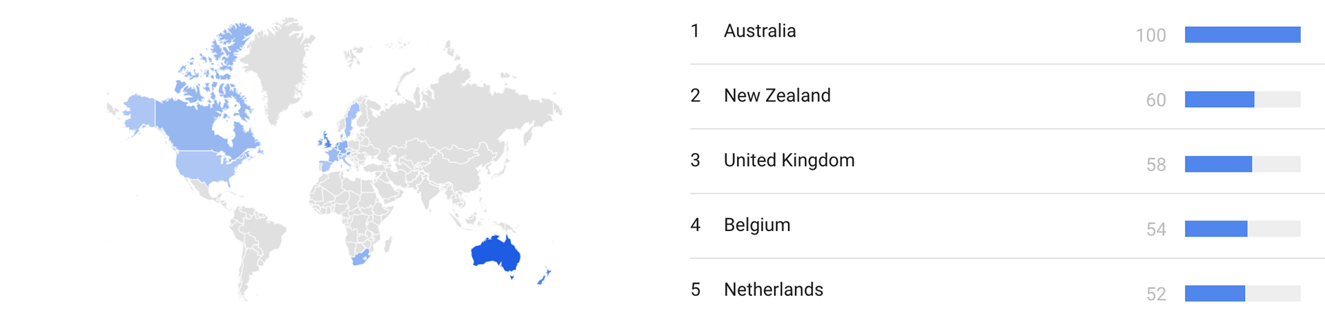
Looking at Google Trends for the search term 'Ottolenghi Simple' we can see the ranking of user locations. This gives a basic understanding of the locations of our target audience.
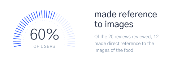
Analysis of reviews found a vibrant community of people willing to share their experiences with other shoppers. This provided a window into users experience regarding the physical book. Focusing on the this will help create a match between the digital product and the real world experience.

Looking for trends when reviewing 20 five star reviews it was noticed that 12 of these made direct reference to the imagines and how it helped them choose what to cook.
Interaction Design Requirements
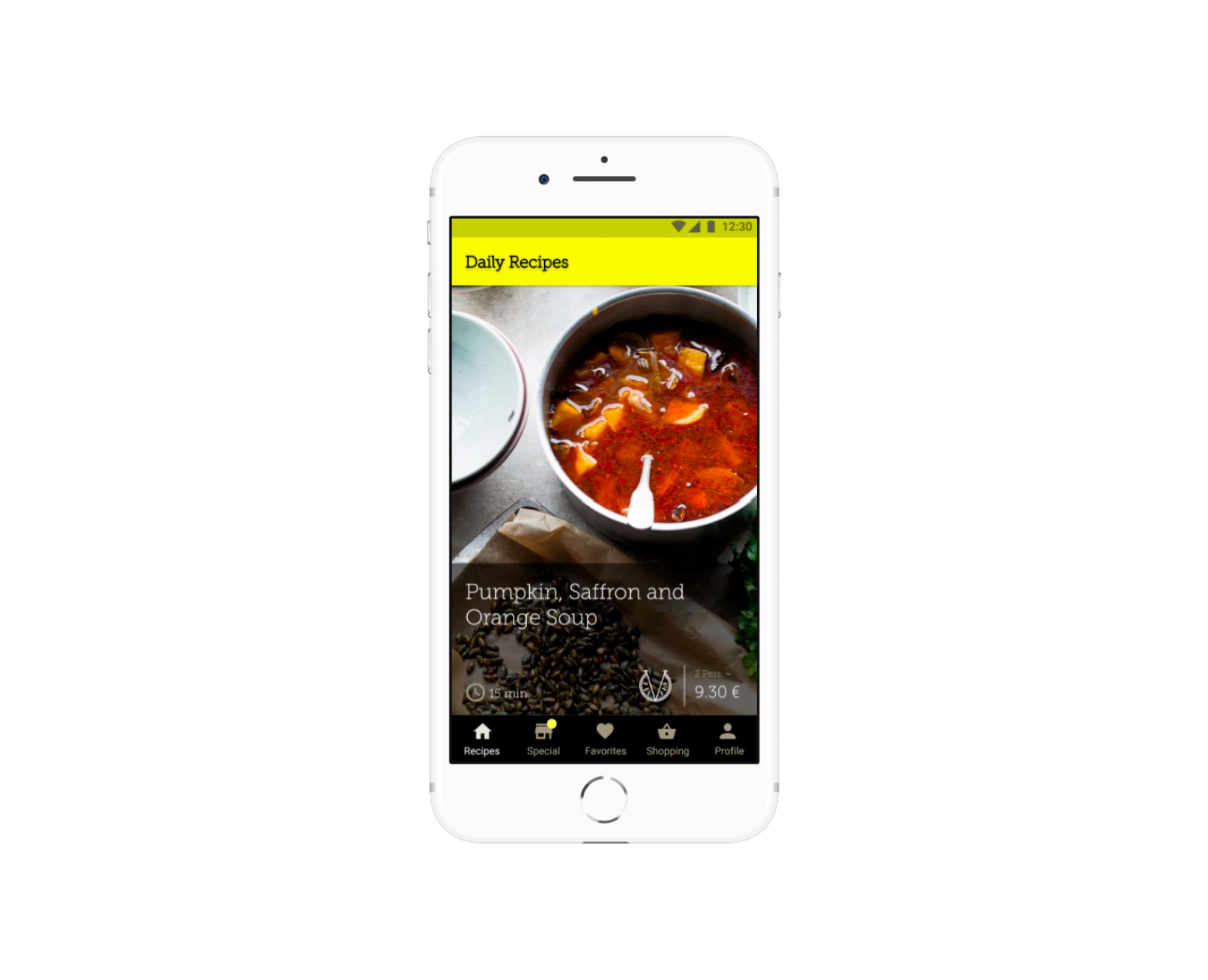
The home page should be totally focused on displaying recipe image. To recreate the experience of the book, it was required to develop a page transition that would add excitement to the process of picking a meal. This would help to maintain the experience of the book in our product design.
Home page of 'The Simple Food App'
UI Solution
Using the spirit of the book, I deployed an intimidation-free approach to page transitions using Adobe After Effects to animate the prototype. Using the interaction of a standard scroll action but with a book-like page transition.
I really love this book and wanted the apps Home page to embody this experience. This is why I choose a 'book-like-transition' between the Daily Recipes. The goal is to minims effort when choosing what to eat for dinner. Also this increases the excitement around what could be on the next page, a personal highlight of mine from the physical book.