

Project
Government websites are notorious for poor design and the Dublin Bikes website is a prime example of this.
UX Process
As an exercise to refine my UX workflow I researched, designed and tested a Dublin Bike mobile app. The app’s purpose is to on-board and locate the nearest bike station. Below are the steps I took for this process.
1. Usability test DublinBikes.com: test with four Dublin Bike customers. Record number of clicks/taps per task and ask test subjects to evaluate the current interface and what they expect to see next. (Don't record keyboard entries)
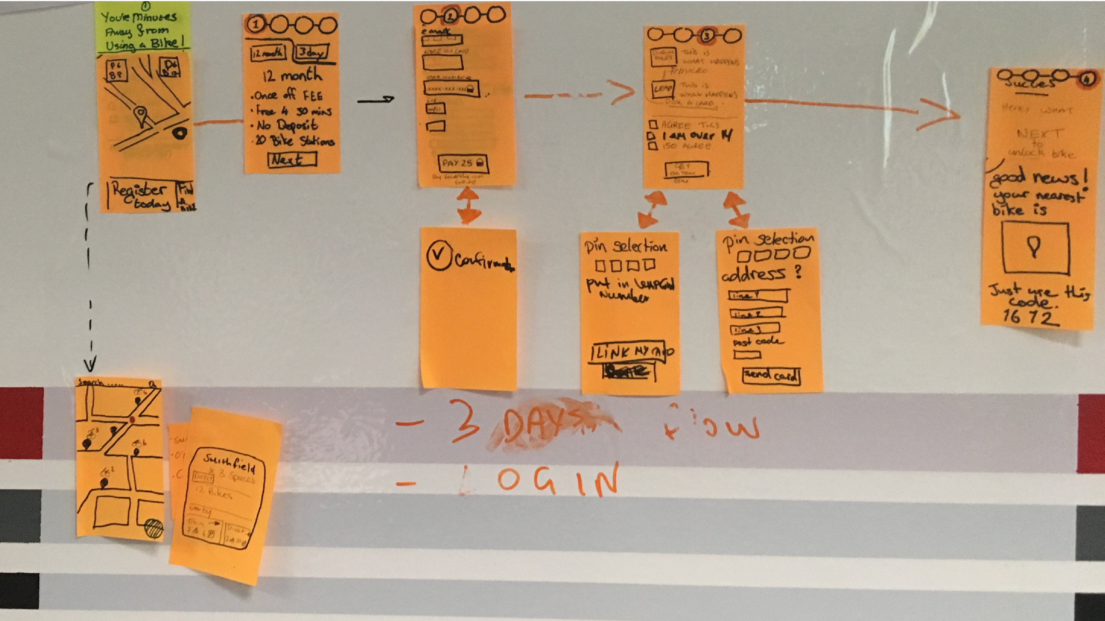
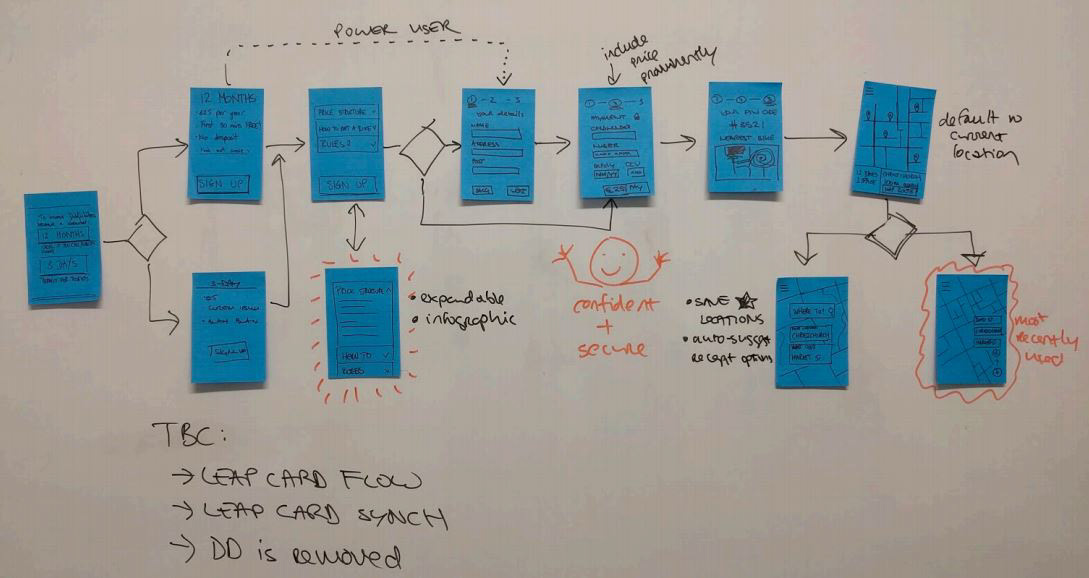
4. Wire-frames: possible solutions to resolve the design challenges with post-its and white board.
7. Design Errors and Prototype Improvements: Use results from the usability testing and a user survey to improve the designs.
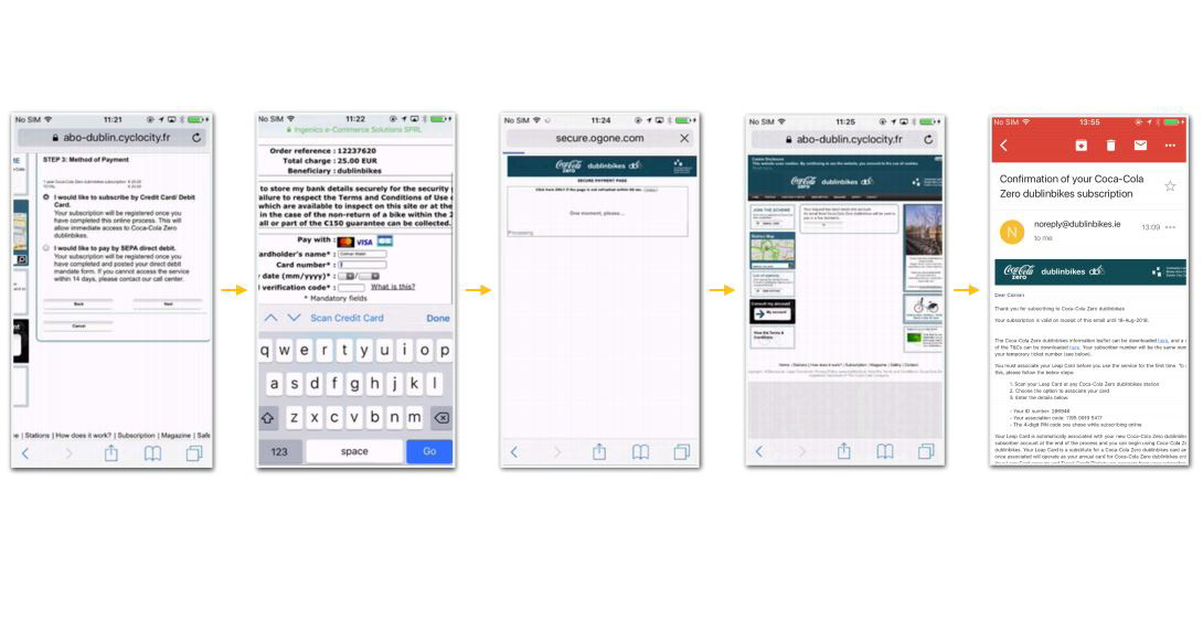
Firstly, the following slide-show gives a detailed examination of the problems users face when signing up to the service in the current DublinBikes.com website.
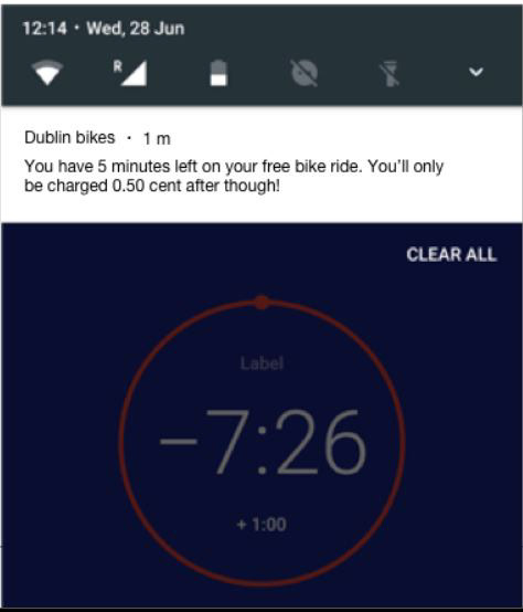
Just to show you what this look like on a phone's screen.
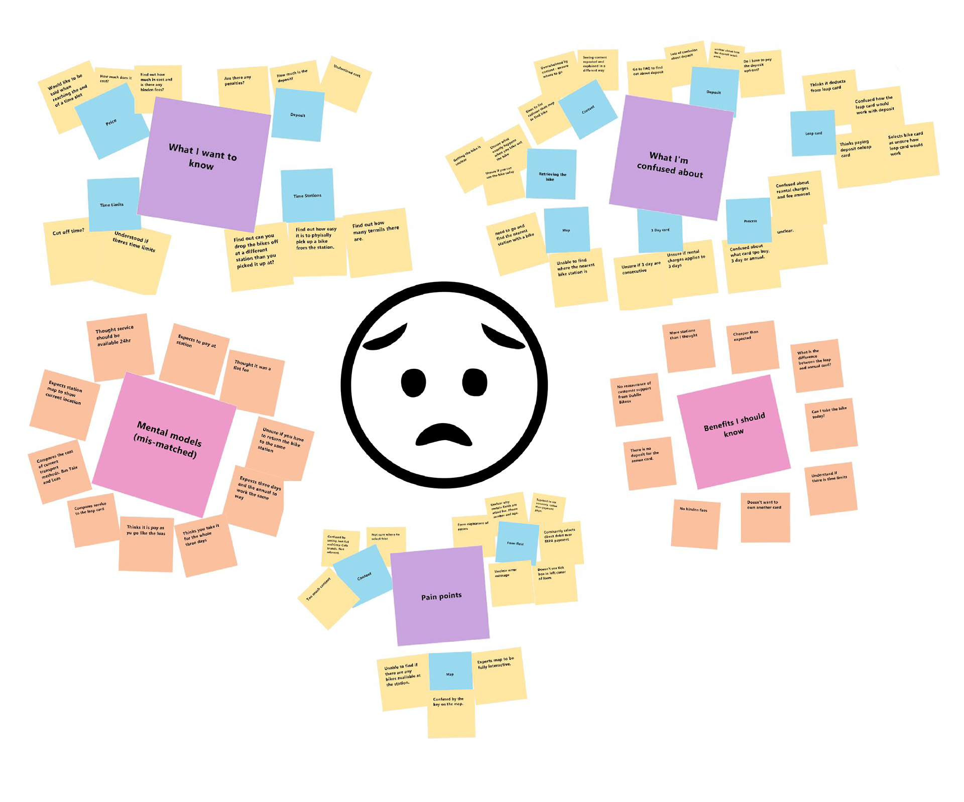
Empathy Map
Too many issues to get into so I condensed the empathy map into a friendly info-graphic below the post-it notes.
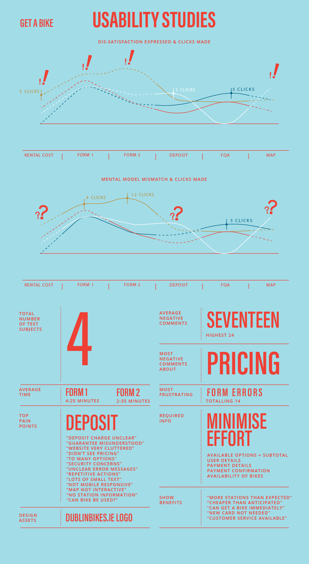
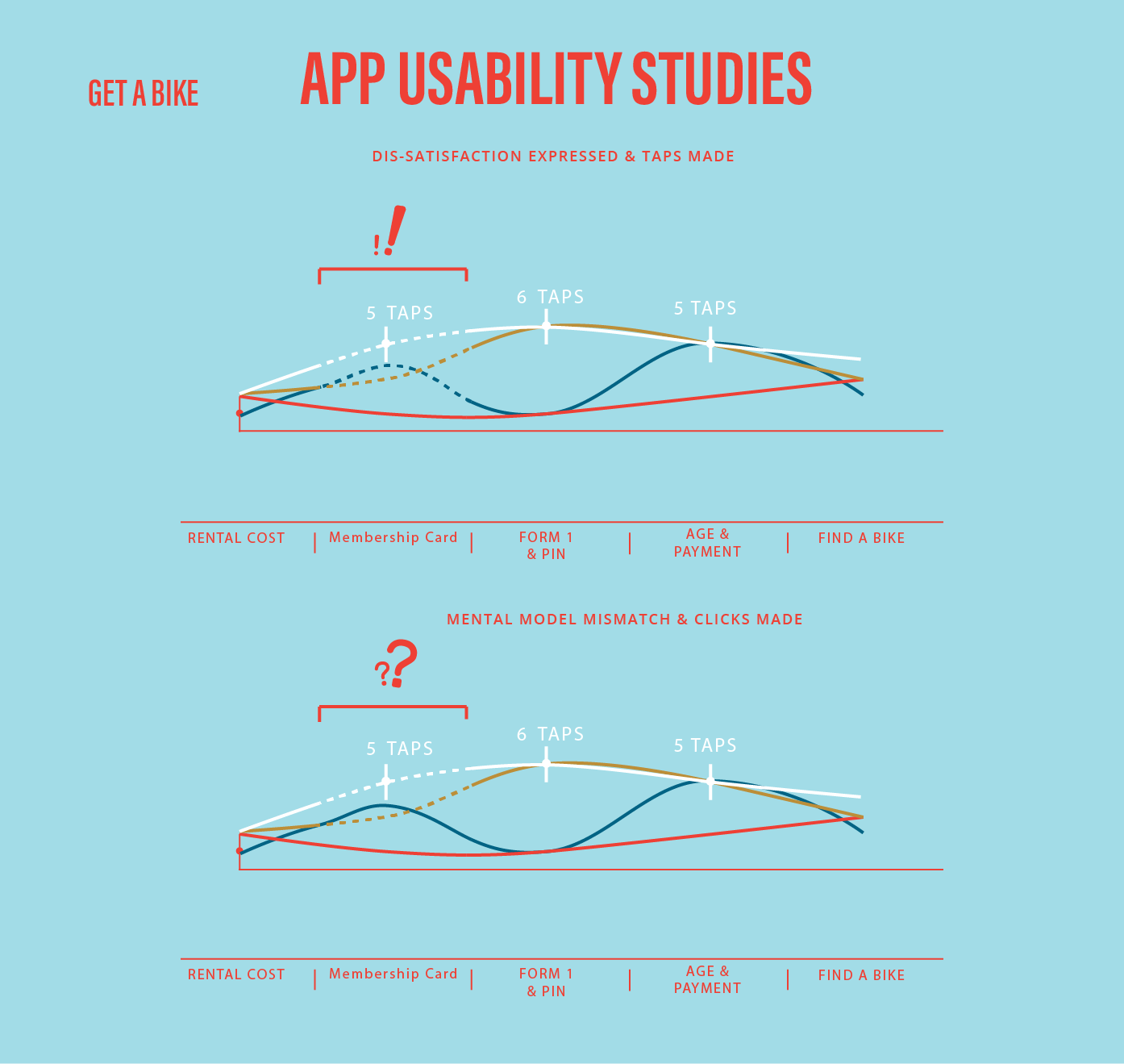
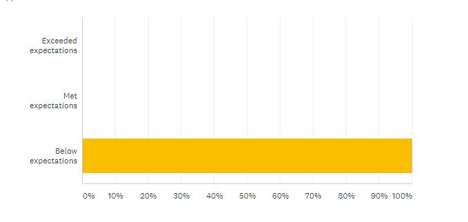
The two charts below describe usability test results for each of the 4 subjects. The first chart shows clicks vs dissatisfaction. The second, clicks vs mental model mismatch. The use of dotted lines signals when the threshold of two negative comment was reached.
Design Challenges
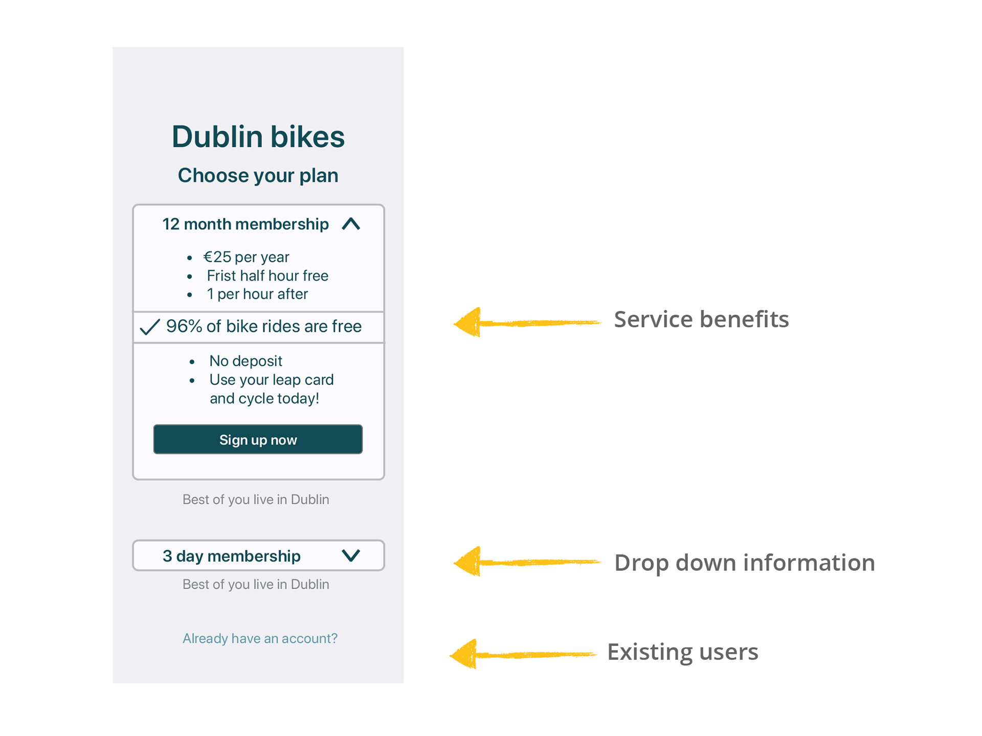
The new Dublin Bike app should be a place for existing customers to find any nearby bike stations and if bikes are available at those locations or not. For new users, all vital information will be provided when the user begins the on-boarding process. There should be no need to dive into the terms of service or FAQs.
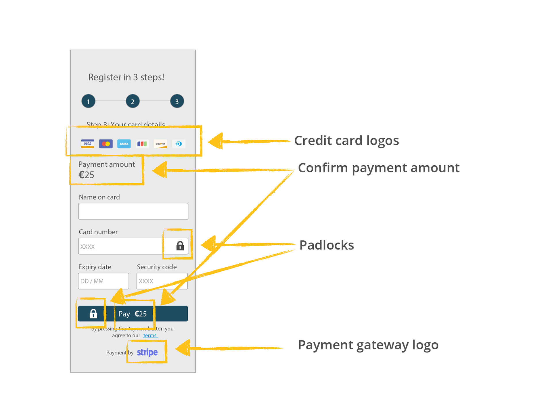
The payment page needs to increase the perception of security. It must Look professional and robust.
The last design requirement that must be satisfied is that once the process is completed the user should be directed to the closest bike station. All the required information to pick up and drop off a bike should be displayed and how to use the PIN and a membership card at the station. These instructions should be clearly understood by users.
User on-boarding requirements
• How much does it cost?
• How am I being charged?
• Are there hidden fees? • How do I take out a bike from the station?
• Can I use it today? • What are the rules for returning bikes?
• How am I being charged?
• Are there hidden fees? • How do I take out a bike from the station?
• Can I use it today? • What are the rules for returning bikes?
I will use wire-frames to map out the best flow that will overcome these challenges.
Design Solution
The mobile app will follow a linear flow style. I will follow the rule of thumb; tell the user something, then ask the user something.
Any information related to the use of the bike and the cost of the service will be displayed when picking the subscriptions length 3 days or 1 year. A simple toggle option is used to see the difference between subscriptions.
The app is deigned to drip feed the infrastructure information as needed with descriptive labels for membership card options and the validate age section. These will employ Check Boxes to speed up the process.
The inputs required will be minimised by providing different paths that only request the information needed based on past answers. This is a proven technique to reduce errors, increase speed and provide a smoother flow.
If the user is required to enter an address, I will provide an easy to scan form layout with top aligned labels. Field length is also an affordance used to guide the user. The app will give the required visual cues to avoid erroneous entries. Each form entry section will provide the correct keyboard for the job at hand – either numerical or alphabetical.
For the payment page, we will use auto-formating for number fields, in particular the card number will automatically be chucked into the format of:
1234-1234-1234-1234 (not 1234123412341234)
This will make it easier to verify and fix errors if needed. The payment section should also perform in-line validation to make this vital section easier to use.
Once payment is verified the bike locator should then be presented to the user after a short message that says, “You are ready to ride”. The locator should be responsive and start with the stations around “your current location”. This is the right time to ask for permission to use the phones location as it is in the right context. The locator must also tell the user if the station has bikes and spaces free.
Test results and improvements
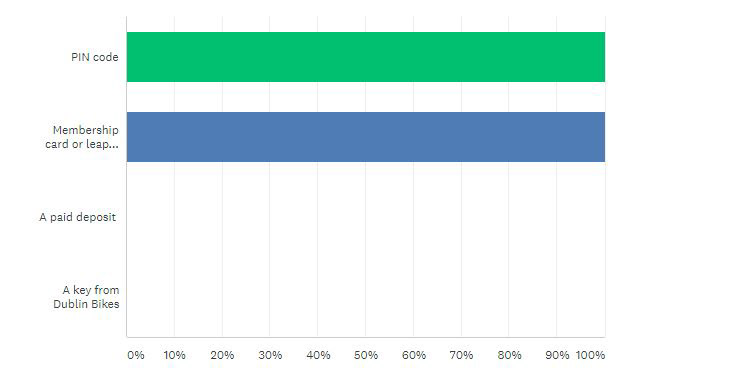
100% of the users understood that the membership card and PIN would unlocked their bike.
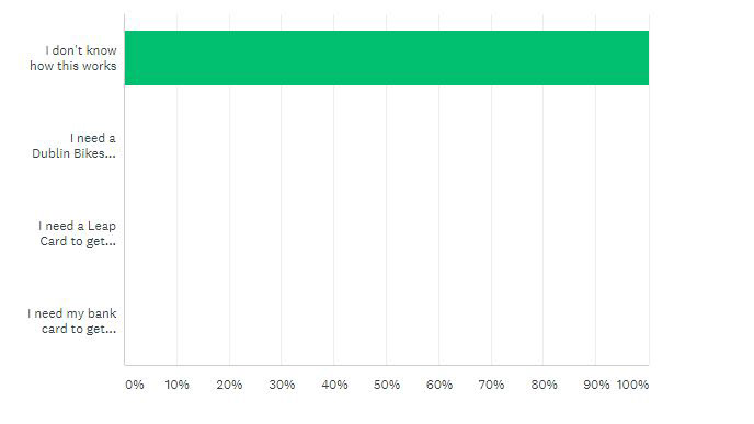
There was no visual cue telling the user that the a leap card was needed to unlock a bike instantly, causing confession for all subjects. This section to fail the usability test.
All users seemed to rush through the information page.
Improved wire-frame for the payment page.
50% of users found the progress feature after the “enter your address” section hard find. One asked "what do I do next", I responed with "what do you think you do next". A progression button in line with the form would be less confusing for users.
The lack of a progress bar throughout the on-boarding process needs to be addressed. Users must be assured that the end is near.
Within the address section there is a drop-down menu. Use of this does not provide a smooth interaction on a mobile device and a alternative would be better.
This service will require an email address. This field was not included in the prototype or wire-frames as the post payment services was not analysed.
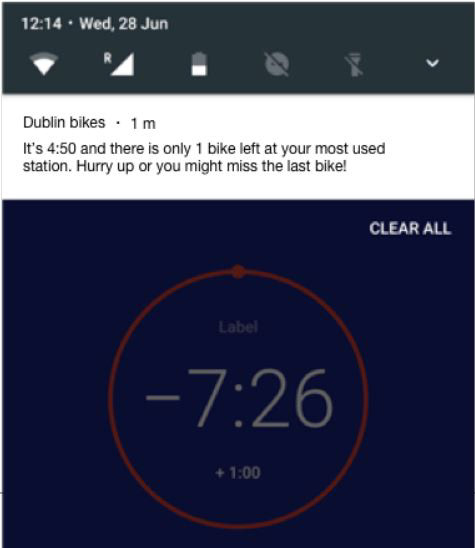
A notification could be sent to notify the user that their favorite station is almost full or is almost out of bikes.
These final changes will be added to a new prototype and then I will repeat the usability study to validate the areas of concern.
Thanks for your interest 😊