Design challenge
Modernising a hair studio that has been in business for 30 years. With the goal of reaching a younger audience. This ambitious project successfully implemented strategic design plans to achieve business growth, branding strategy to deliver a stronger competitive position and a marketing strategy to increase financial performance. The consumer experience was overhauled to maximise comfort, a sense of professionalism and the homely atmosphere highlighted by clients in our brand story development. The outcome was a 23% increase in revenue in 2018 compared to 2017. This was mainly due to an increase in product sales of 49% for the same period. This enabled more productivity, exactly €3.80 on every services when comparing each year. Footfall increased a total of 15% in year on year. Sadly, the decline in age did not meet strategic goals, down to 39 from 41 years old.
A major goal was to developed a Standard Operating Procedures for marketing the salon's professionalism on Facebook and how to increase followers on Instagram. The scope was set after an initial costing report, it includes re-positioning of the brand and interior renovations. Within the creative brief, the General Manager has guidelines of how to take pictures of clients for promoting the service online and how to best design the window and shelving displays. The branding strategy document contained examples of the language to be used online.
To develop the current brand story document, we interviewed clients and staff. It was clear that there was a gap in the perception of the core values between the two. There was no mention of professionalism in the client interviews and most worryingly of all, the "relaxing" value wasn’t picked by any of the staff or clients. This value was a part of the mission statement and highlighted during within the brand strategy development.
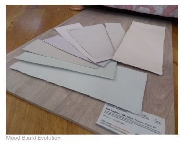
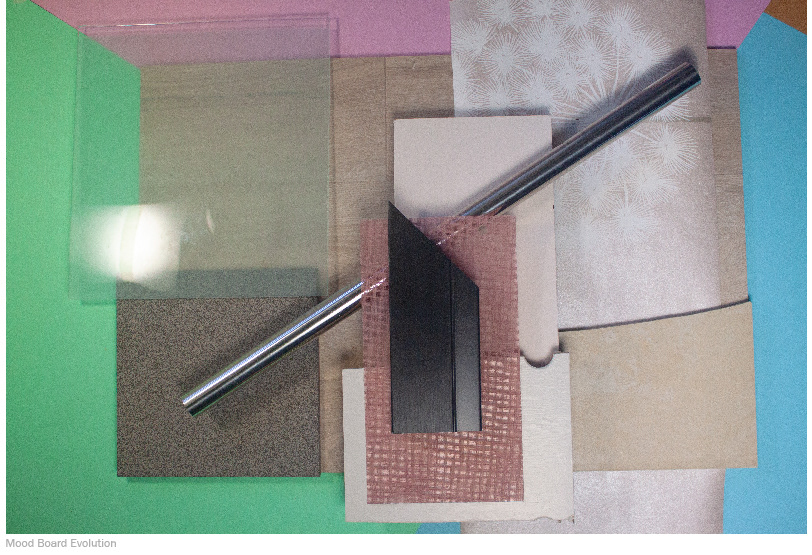
The creative brief was then developed, with this initial mood board being part of that document. It's creation helped guide the physical mood boards for the interior design. It was also the initial point of reference when developing the branding elements such as, colour scheme, fonts, logo and internal and external advertisements.


There was a need to develop a trust with new clients via the branding elements. A sleek and stylist word-mark with the underlining font expressing high end style. The trust is relayed further by the “Est. 1988”.
Interior Transformation
The interior now uses a much lighter colour scheme. The psychology behind this choice means the client is at the center of attention. Warm but light colours make the client stand out from the walls and floor, achieving the goal of professionalism but yet keeping the studio's homeliness intact. With storage now utilising a trolley system, their is nothing between the wall facing the client and their refection.
All take home products have been moved to the doorway. The marketing strategy helped the staff personalise their sales pitch and has examples of do's and don'ts for training purposes. This marked an upturn in product sales from 16% to 20.6% of total revenue from 2017-2018.
All new surfaces were tested for resistance to hair dye to ensure a satisfactory life cycle.
Furthermore, the mirrors, custom footrests and glass shelves deliver a none intrusive experience, and are very sympathetic to the style of the current chairs. The manner in which they are attached to the wall also helps deliver the none intrusive design goal, helping the client be fully immersed in the service they are receiving.
The challenge here was to make this corner look brighter and to highlight the relaxing nature of the service offered at the sinks. We have changed the lighting colour so that it aligns with the homely atmosphere. This section now has a softer, more welcoming glow. This increased sense of relaxation is further embellished by the calming dandelion wallpaper that surrounds this area.
The challenge here was to make the back corner look brighter and to underline the relaxing nature of the service offered at the sinks. We changed the lighting colour so that it aligns with the homely atmosphere. This section now has a softer, more welcoming glow. This increased sense of relaxation is further embellished by the calming dandelion wallpaper that surrounds this area.
When pointing out the window display during a client interview, they highlighted a dislike to sit in the window seat when the window was bare. As shown in the before image below, the view to the street was blocked by any mans necessary. This has a very cluttered look. Therefore, keeping inline with the minimal style, sleek box shelves with products are used to block the view when in this seat. All five box shelves can be moved up, down and across allowing for different configurations. This gave the General Manager the ability to display 10 more items than previously and all at eye level, while giving a must clean look from the outside. Also, possible new clients are easily able to see the beautiful new salon much easier than before.
The footrest provided the biggest design challenge. Material selection used a stainless-steel grade with high yield strength. The issue of an expensive and weak base-plate was overcome by using injectable adhesive anchoring resin to set the footrest into the concrete.
Store Owner: Kathleen Redmond
Creative Director & Product Designer: John Redmond
Branding & Marketing Strategy: John Redmond
Build Team: Micheal Redmond, Shane Murphy, James Murphy, Micheal Finn
Special Thanks: Carlow Glass & Curtain Creations Wexford for all their time effort
Creative Director & Product Designer: John Redmond
Branding & Marketing Strategy: John Redmond
Build Team: Micheal Redmond, Shane Murphy, James Murphy, Micheal Finn
Special Thanks: Carlow Glass & Curtain Creations Wexford for all their time effort
