
The Challenge
Online flight booking has been around since 1995, when the Internet Travel Network sold the first online plane ticket. You would think that this market maturity would have allowed this sector to be the outright market leader regarding customer satisfaction.
But the this is not the case! Flight booking sites are not praised by their users as much as the latest taxi apps (Uber has a 4.7/5), or customer banking apps like Revolut (Revolut has a 4.8/5) and N26 (N26 has a 4.8/5).
Ryanair has a 4.2 rating
Norwegian Travel Assistant has a 4.1 rating
Momondo has a 2.3
Jeta Board 2.5
Lastminutes.com has a 3.5 rating
BudgetAir has a 3.5 rating
Can I highlight some of the reason this is the case and make measurable improvements?
Process
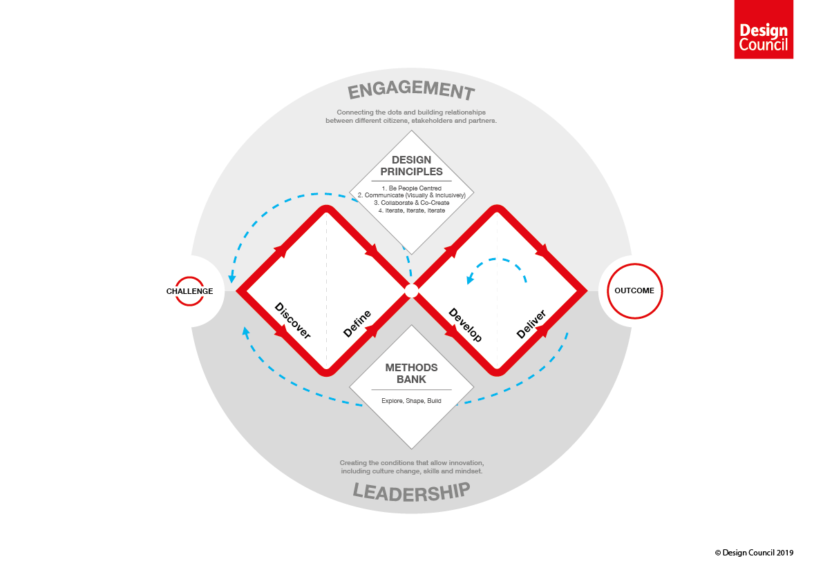
I will use the Double Dimond approach to guide a divergent and convergent style of design thinking to discover and define the aspects that I will tackle during the development and delivery of the designs. This will allow an exploration of the issue more widely (divergent thinking) and then a more focused action to be taken (convergent thinking).
Deliverables
User Research (Discover)- Competitive Benchmarking, Research Goals, User Screening Document, User Interviews (4 participants) & Usability Testing (7 participants tested on Ryanair), Script and Test Video
Research Analysis (Define)- Usability Testing Report, Affinity Map, Customer Journey Map
Design Iterations (Develop)- Navigation & Flow Diagram for Mobile (Balsamiq), Interaction Design sketches for Mobile
Prototyping (Deliver)- Design of Branded & Unique Components (Figma), Development of Frames (Figma), Wire Frames detailing Design Behaviour
Prototype testing (Outcome) - Usability test Report
Competitive Benchmarking
Competitive benchmarking helps develop the Research Question. This step highlighted that the price conscious users often had a hard time.
Dark patterns all over the place (Is this optional or required)
Required fields aren’t highlighted
Too many call-to-actions with the same weight
Having too much noise in critical steps
Research Question
Can web literate users, successfully accomplish tasks such as booking a round-trip flight, finding the lowest-priced tickets and fully understand the rules for carry-on baggage?
Furthermore, investigate the design decisions, highlight usability issues and outline corresponding recommendations using quantitive and qualitative research methods.
This study will only investigate the process of flight selection and the location of and user understanding of baggage charges.
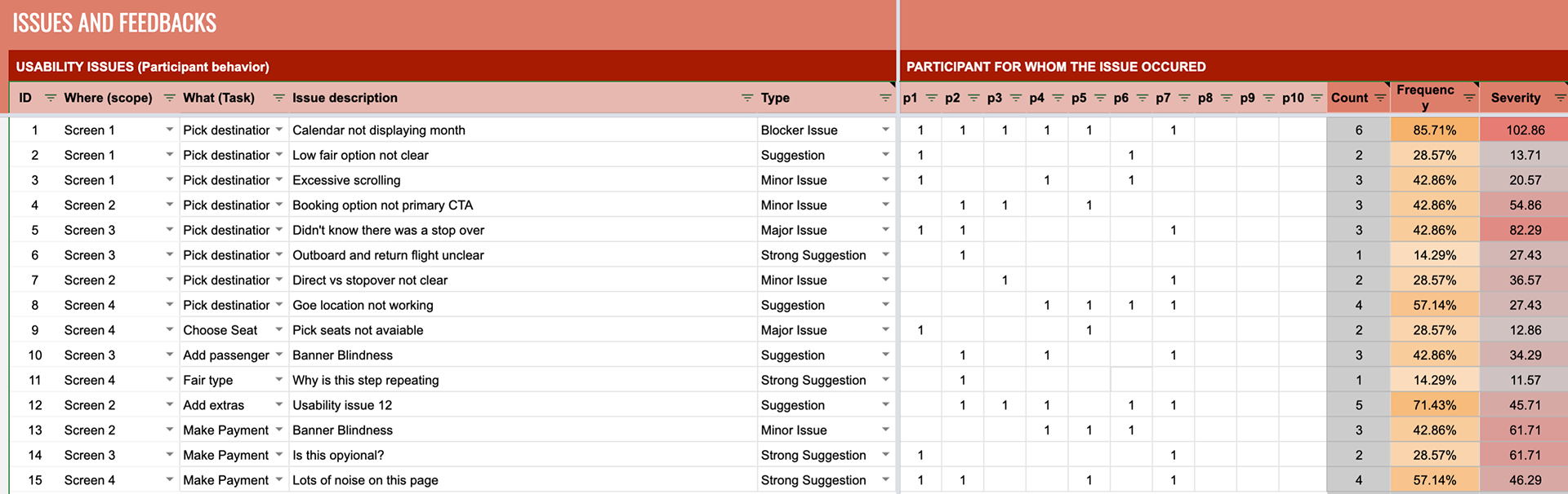
Usability Test Analysis
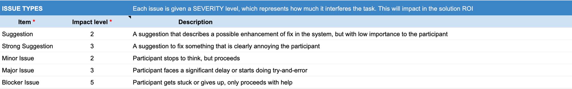
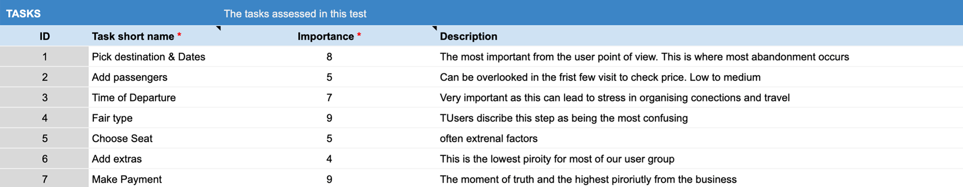
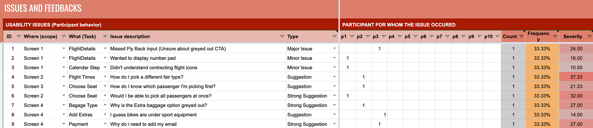
A Key user flow is choose that will encompass everything highlighted in the Research Question above. An Issue Identification (ID) system is used to calculate the frequency and severity of an issue.
Frequency = the sum of Sum of Participants / Total number of Participants
Severity = Task criticality x Impact x Frequency
Types of issues and the weights given to each Issue type are displayed below.
Task setup is where business criticality is set for each of our Usability Test Tasks.
Recording the results
Record 'Where' the issues occurred. Under 'What' record the Task which the issue belongs to, followed by a short 'Issue Description'. The issue description should try and relate issues to the NN Group Usability Heuristics for consistency.
Use 'Type' to set the interference of the issue on the overall experience. And record then record which Participant it happened to.
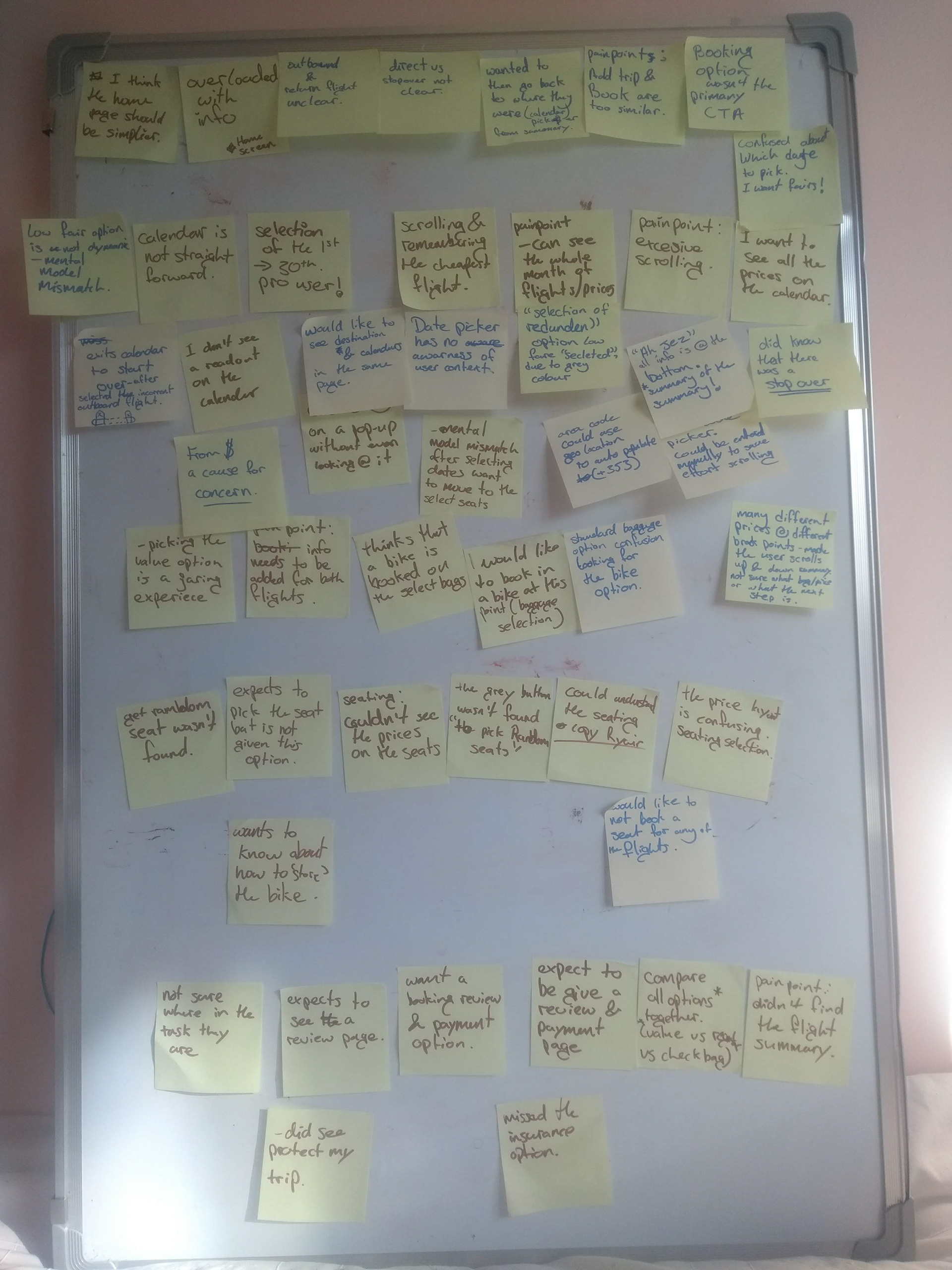
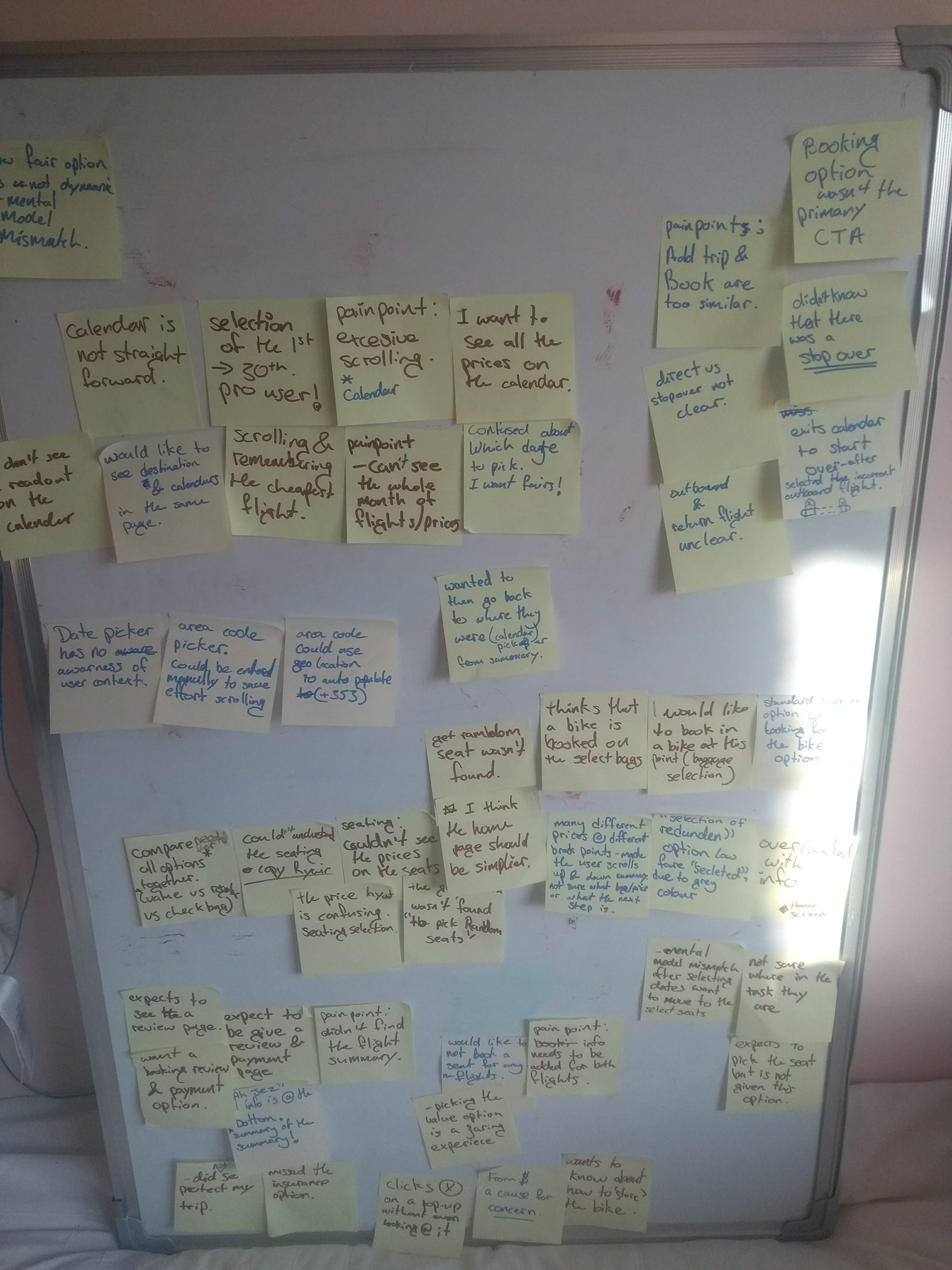
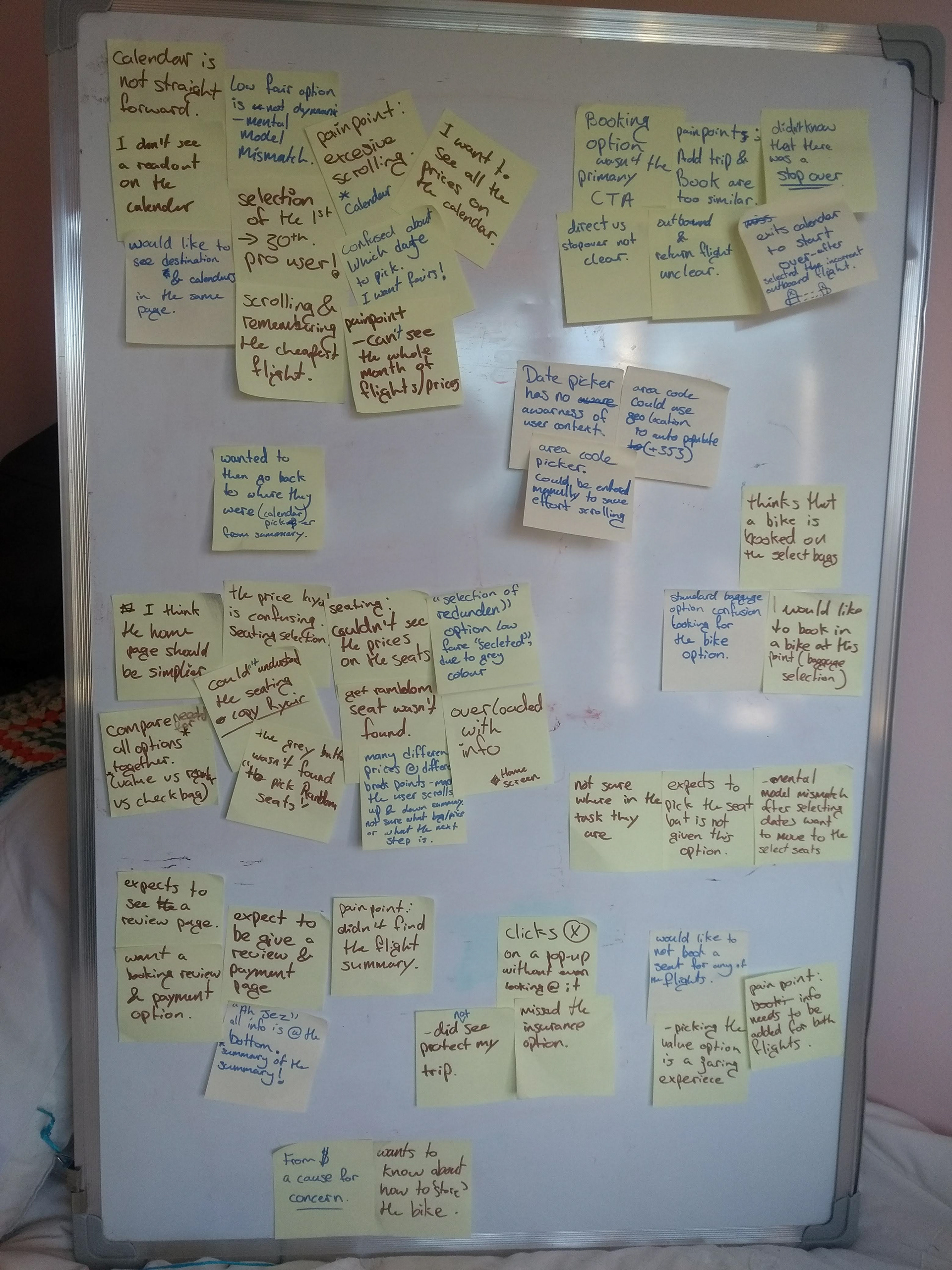
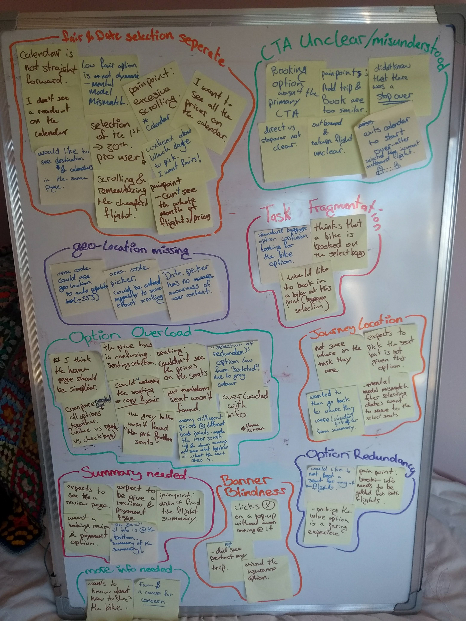
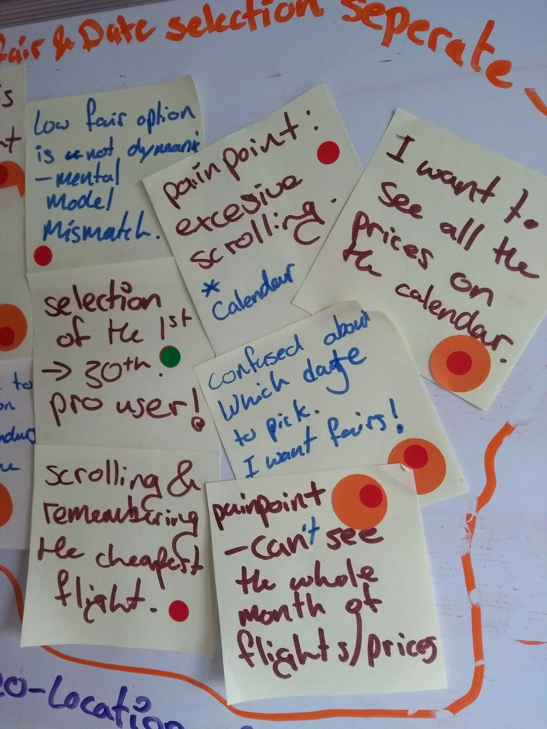
Affinity Mapping
This step was under taken in collaboration with a colleague to help mitigate any cognitive bias that may have been present in the usability test analysis using the ID system.
We used a sticky dots to votes on what we believed to be the most important issues raised during the usability testing. These were then added to the draft user journey.
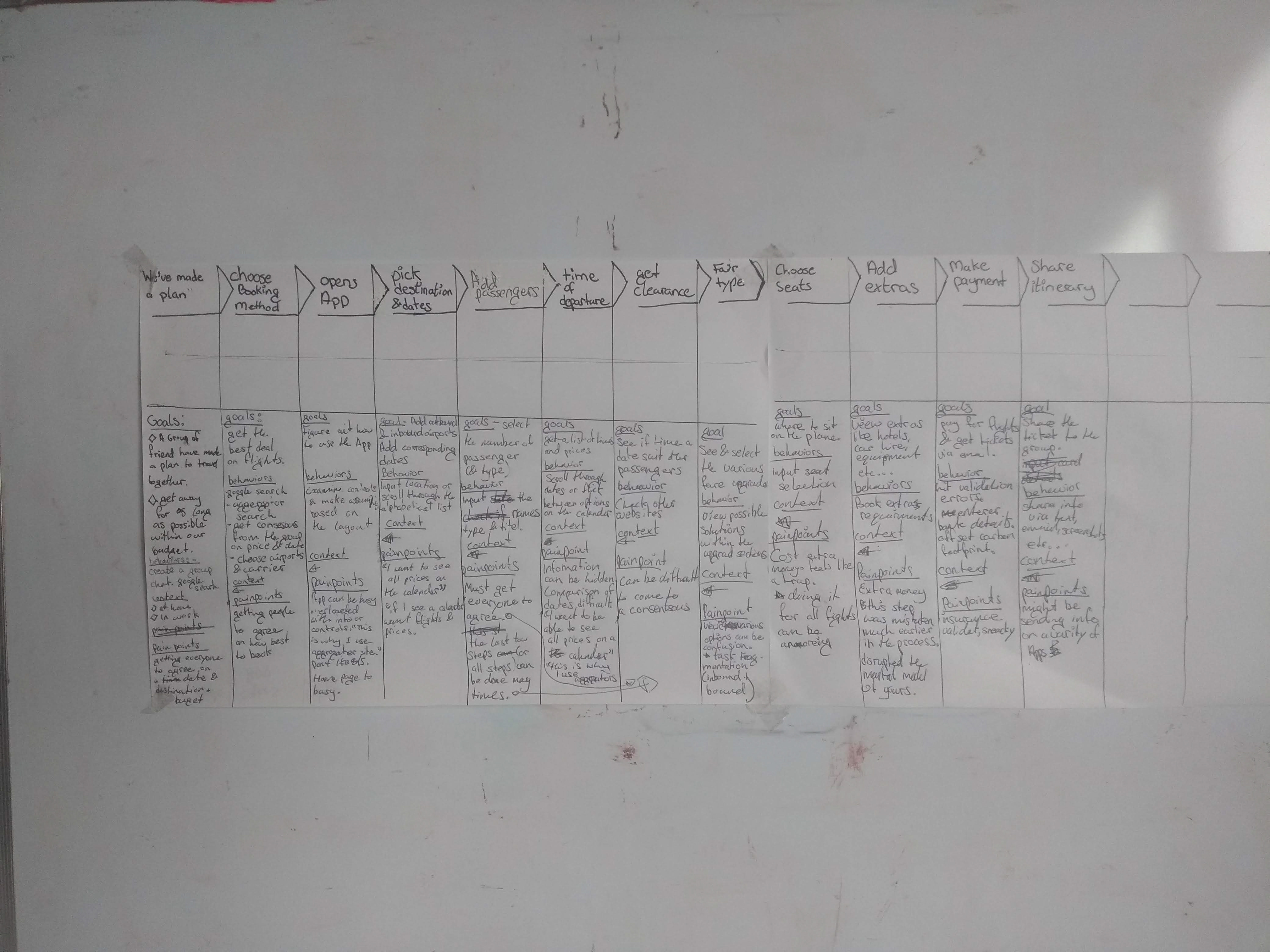
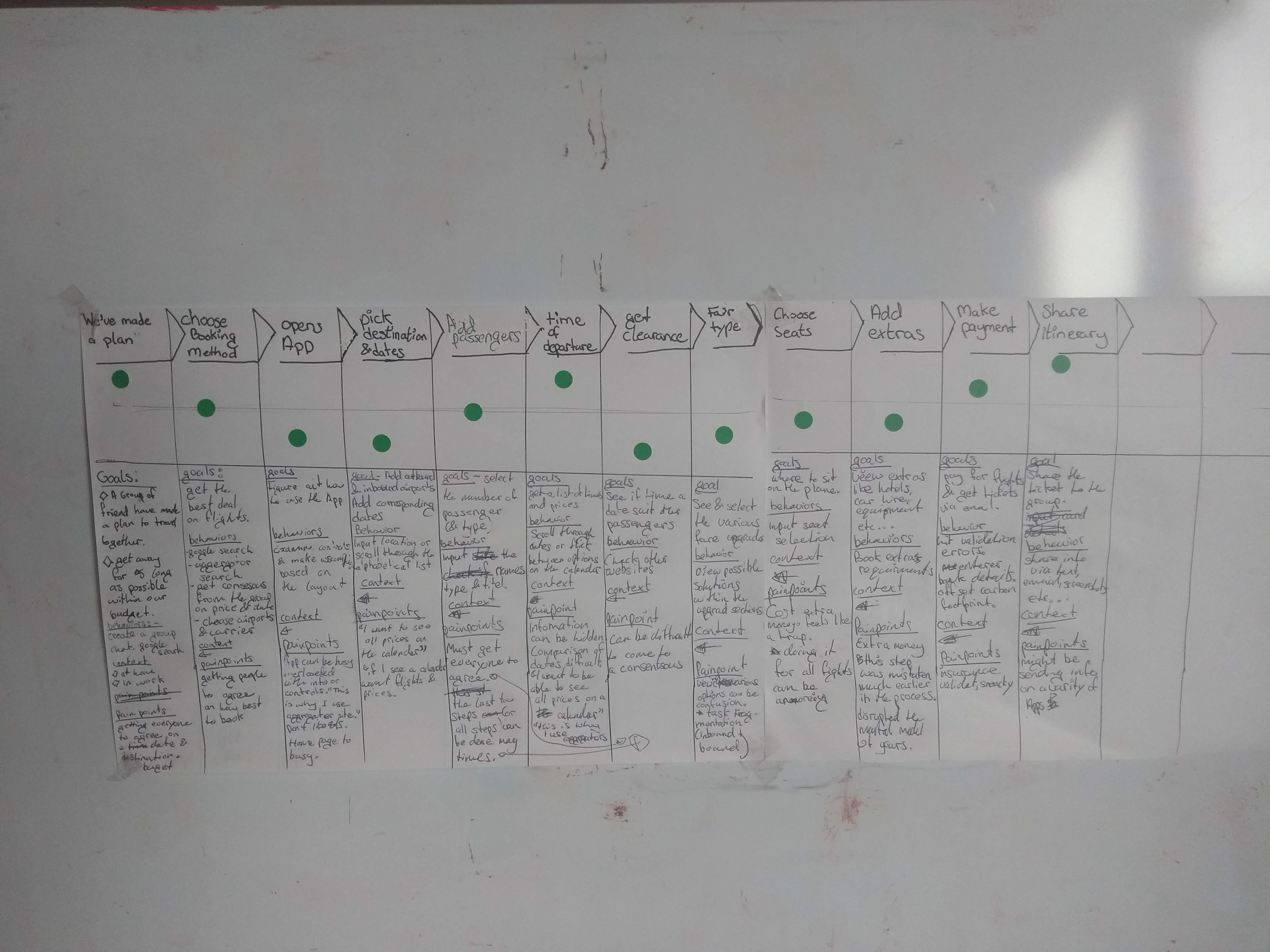
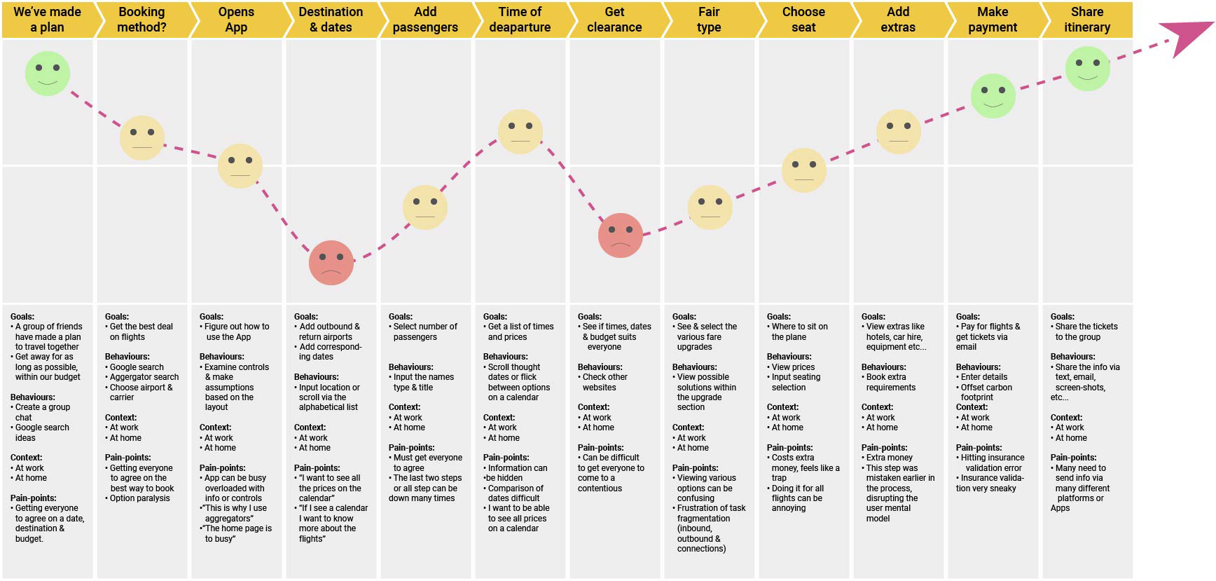
User Journey Mapping
This step combined insights regarding the user context and the results of the usability test analysis, we develop a Journey Map. This shows that the user goals changes as they return to the site. Picking the destination and dates was the low point.
Design Brief
Brand and design components for a budget airline's mobile booking system. There should be no patterns used that obscure users picking the most cost effective option. Streamline the booking process compared to the benchmark set in the discovery stage of this case study. Reduce the total number of issues raised by 33%. Flight Details & Date picking, Fair Type & Payment must all see a reduction in issue severity, as these are business critical task.
Deliver a medium fidelity prototype for the propose of usability testing and compare the outcome to the benchmark.
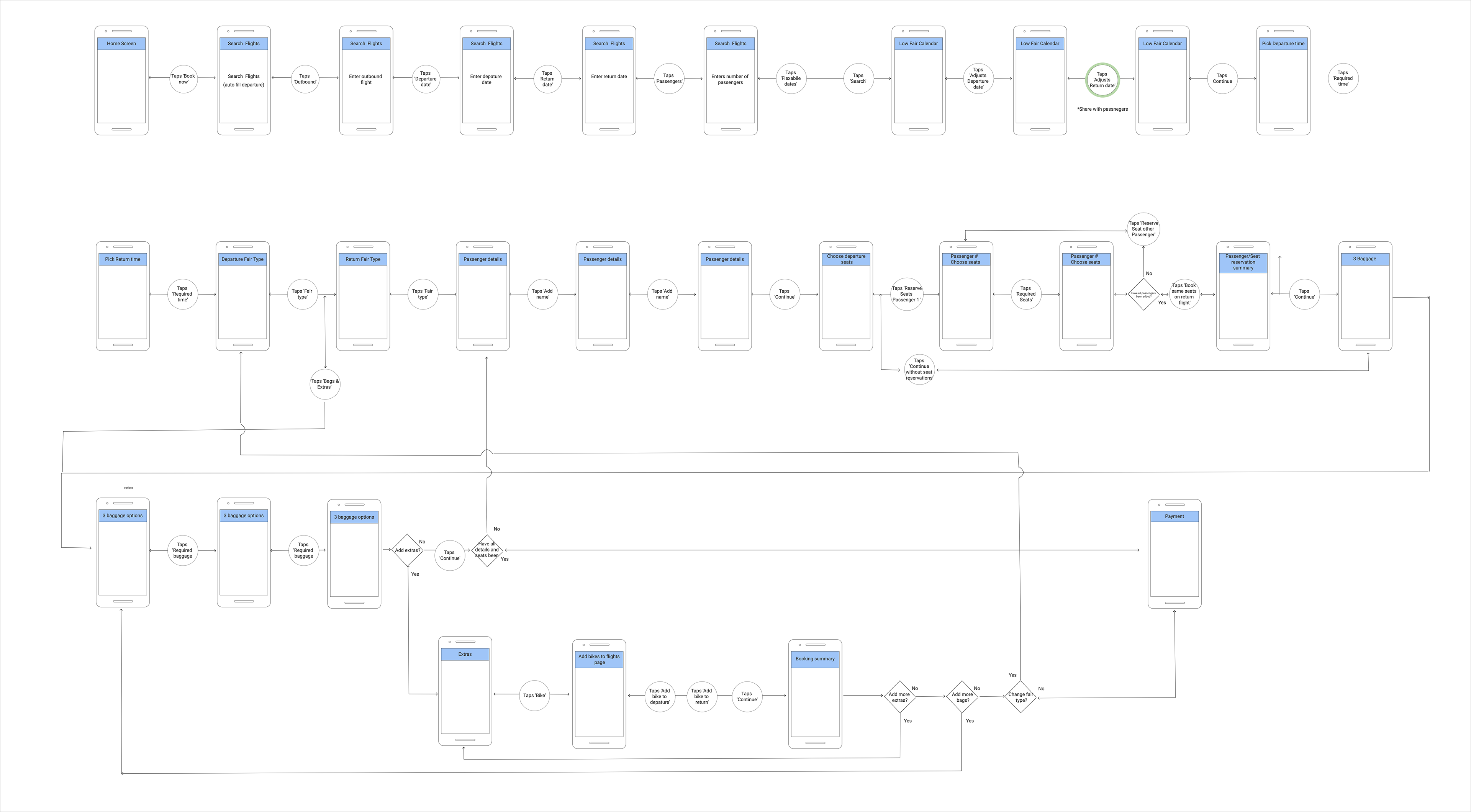
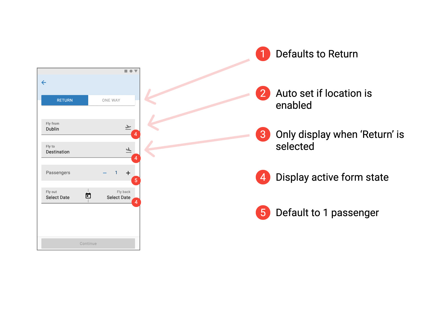
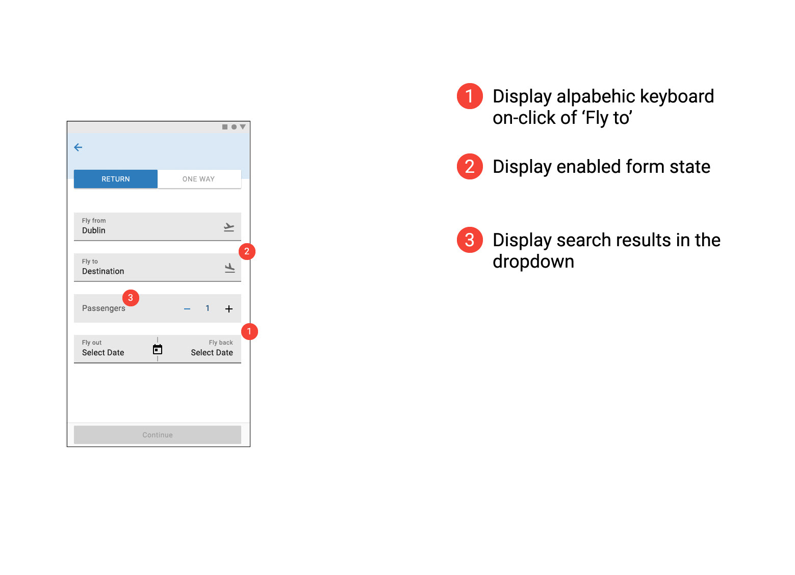
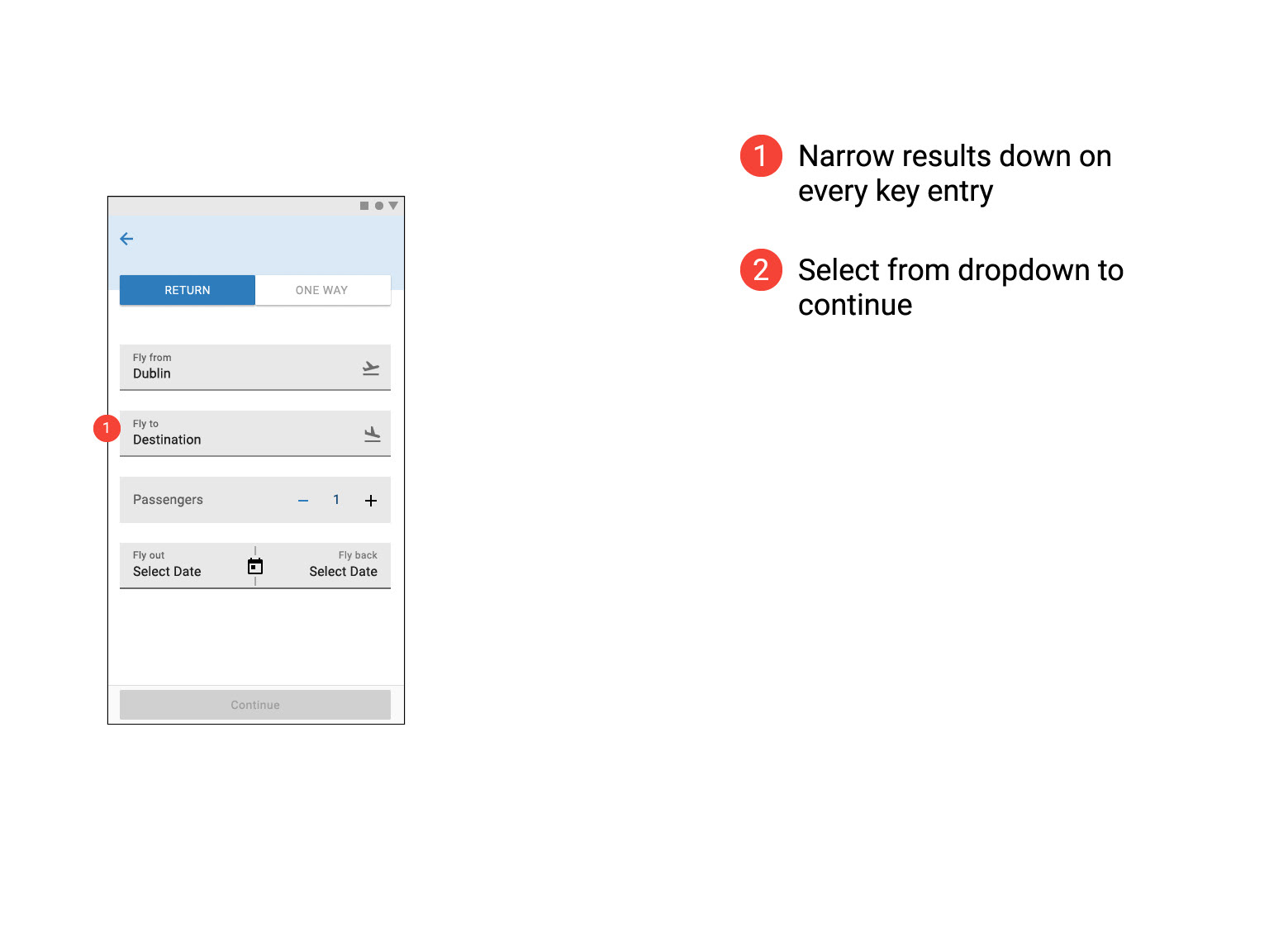
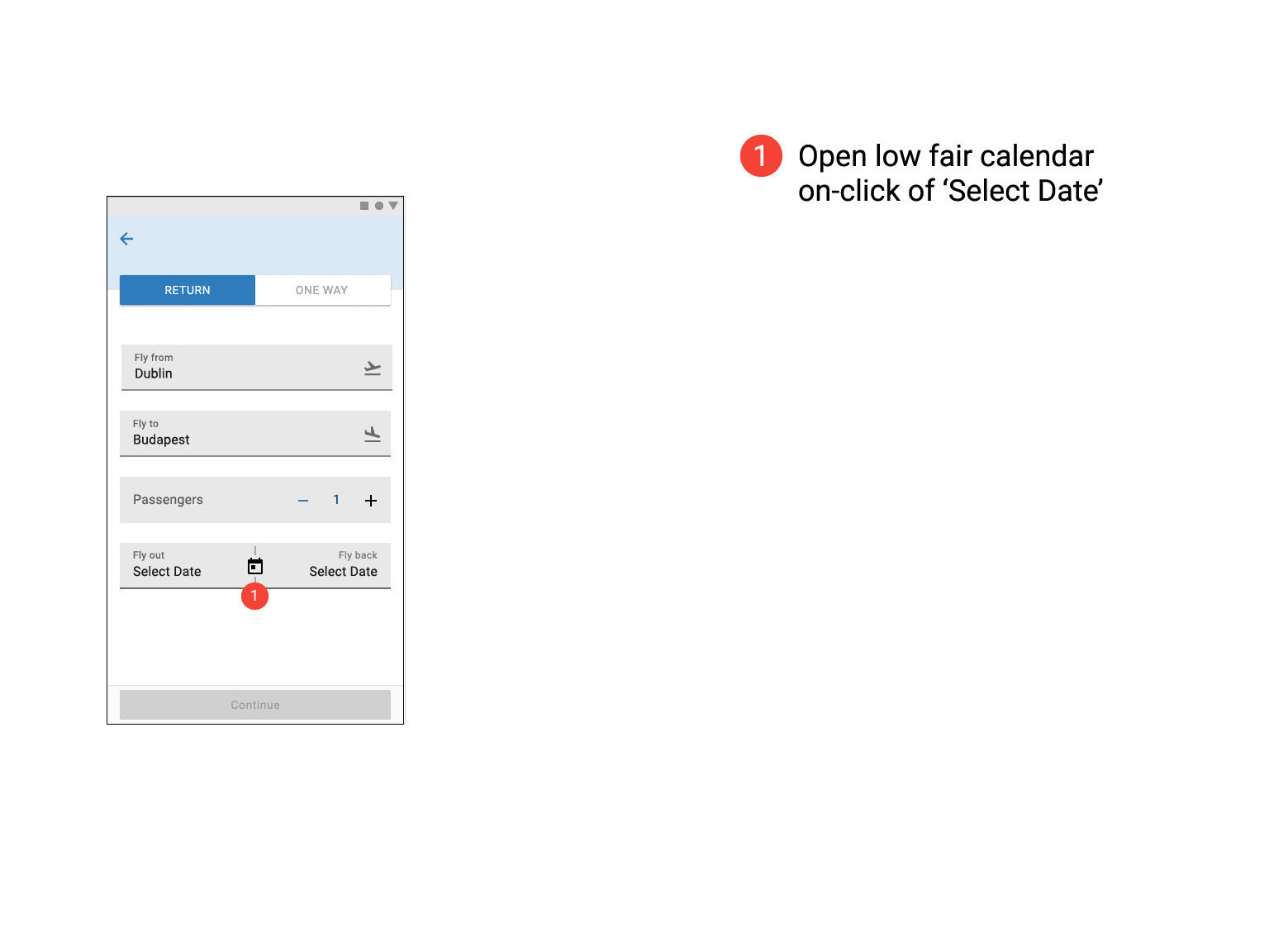
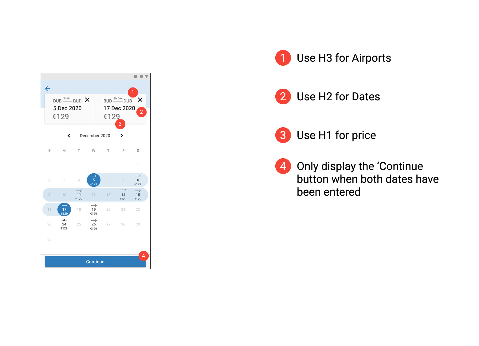
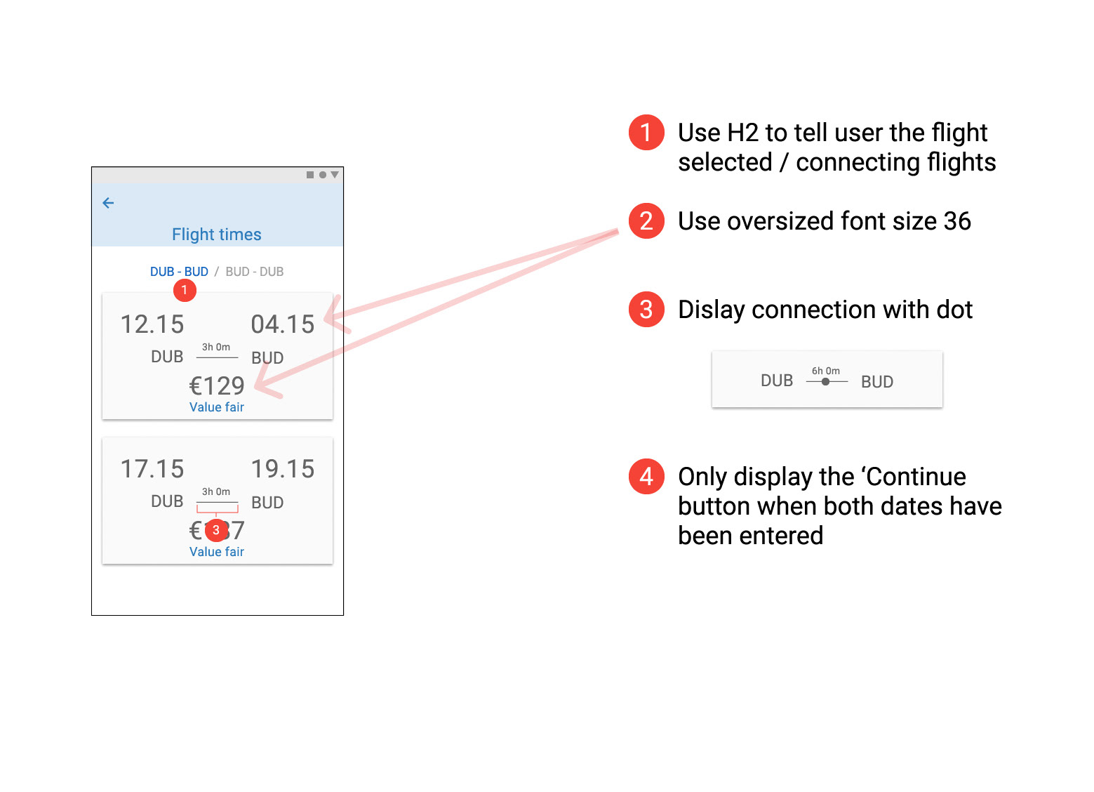
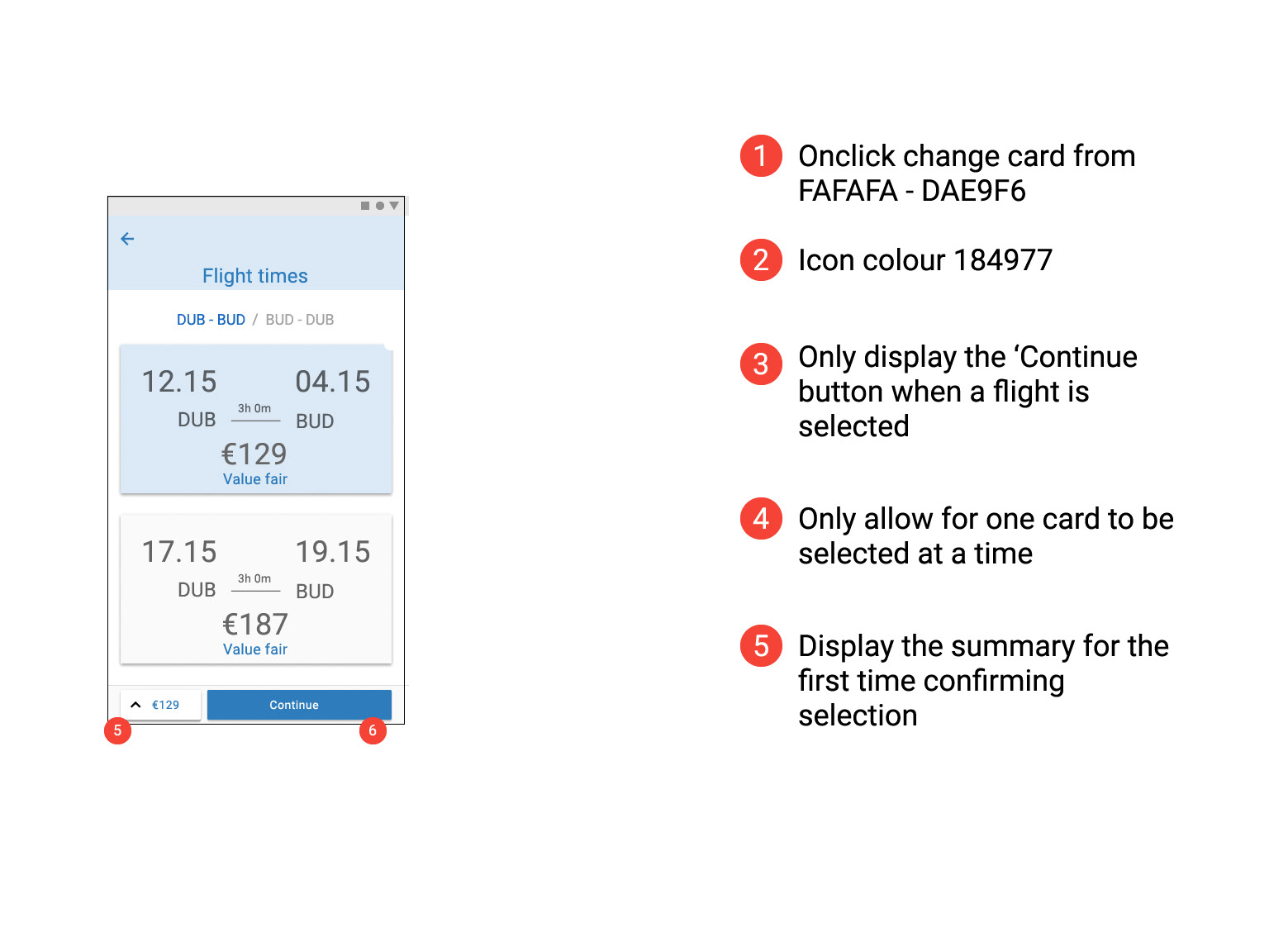
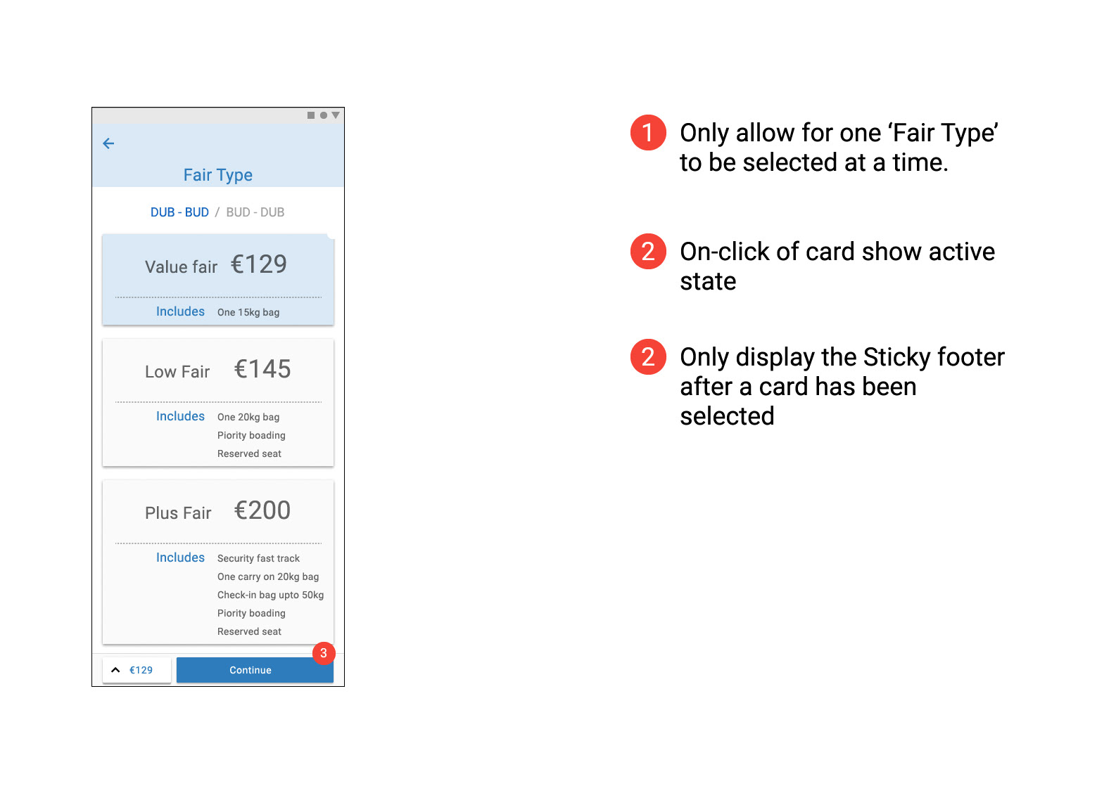
Navigation Design Intent
A linear navigation style is used to get users to the point where they have chosen an option for all the requirements needed. After they have successfully picked their choices, they are given the option to use hub and spoke navigation when they reach the summary page and have the additional option to expand the summary footer on each page. The intention here is to address how some users were unsure of the baggage chosen, giving them an easy way to navigate back to the baggage during the summary if they felt they needed to make changes. This function was not made available until the main process was complete as it would make the flow complex for most users.
*This is a good time to review the business viability with the wider Product Team.
Interaction Design
Using the navigation template, the screen interactions were developed in conjunction with the User Journey Map and the Usability Test Report to reference pain-points and ensure that user goals, behaviours and context are being accommodated.
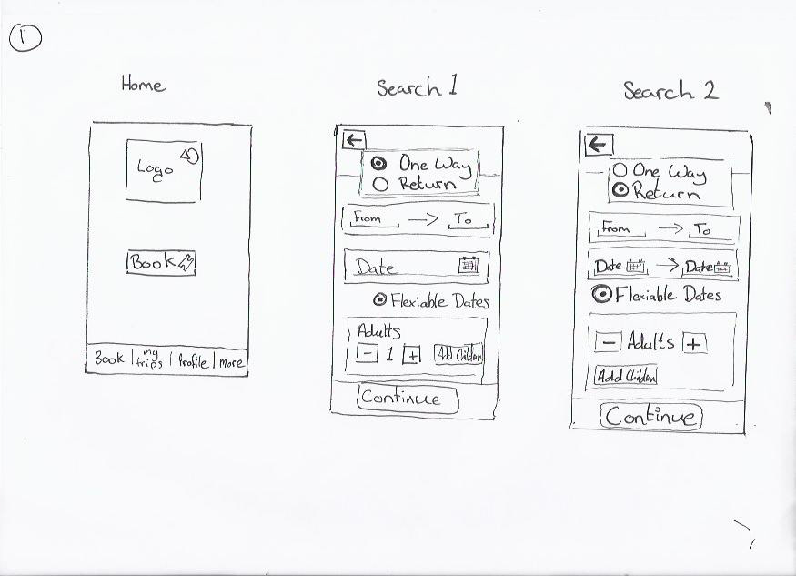
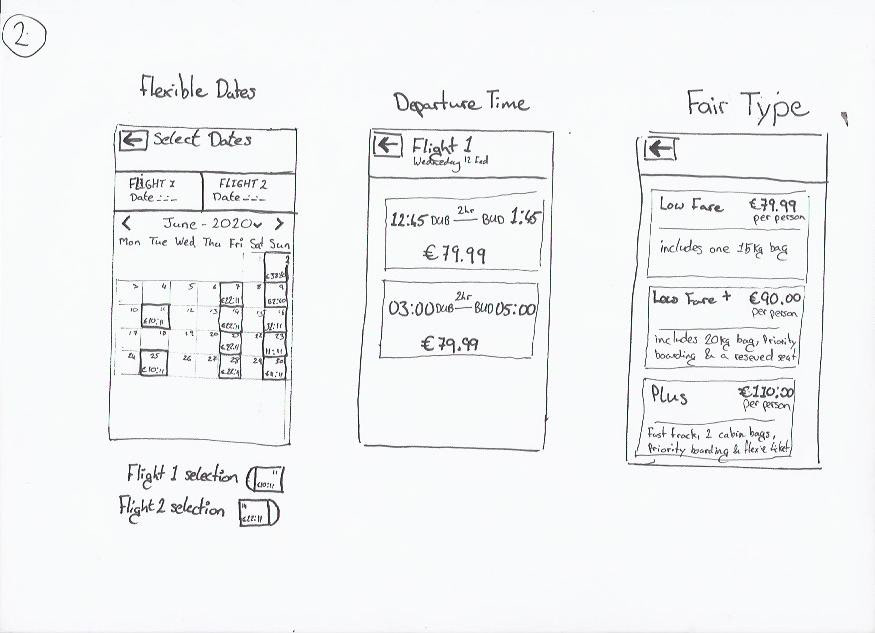
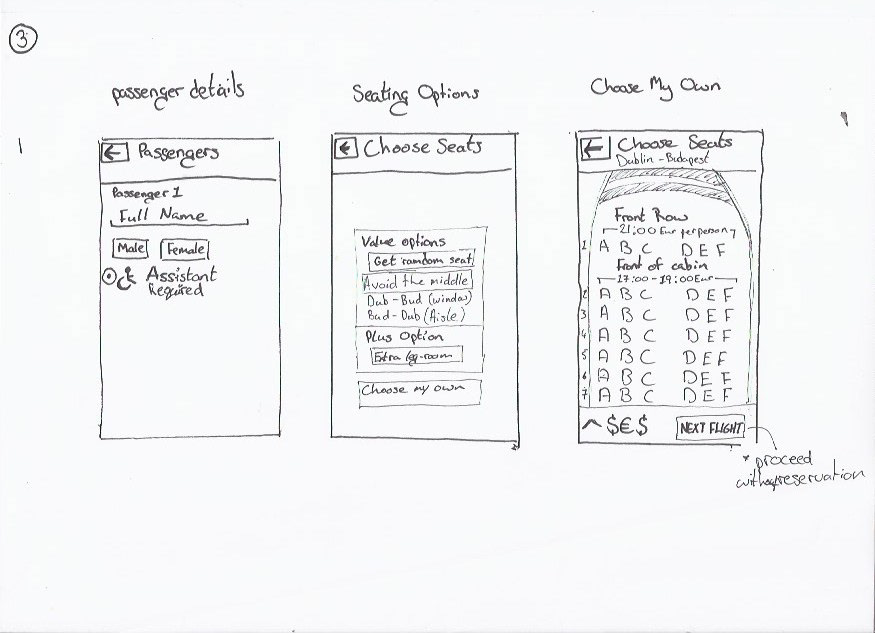
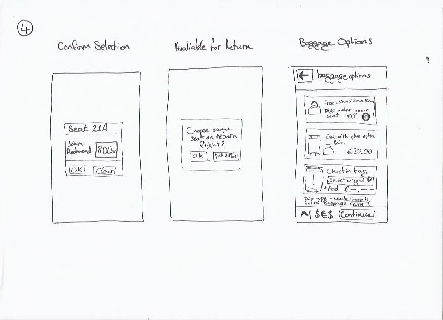
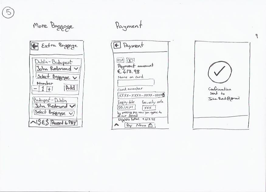
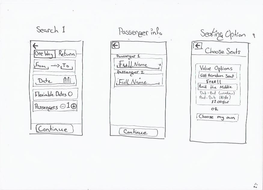
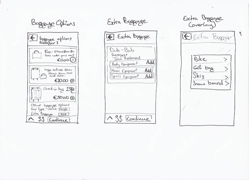
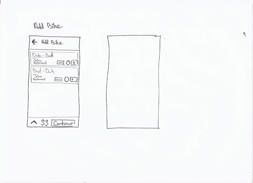
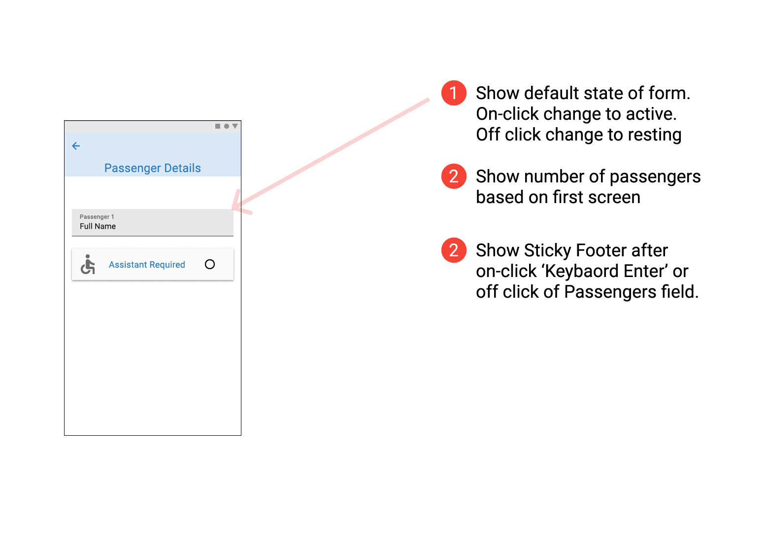
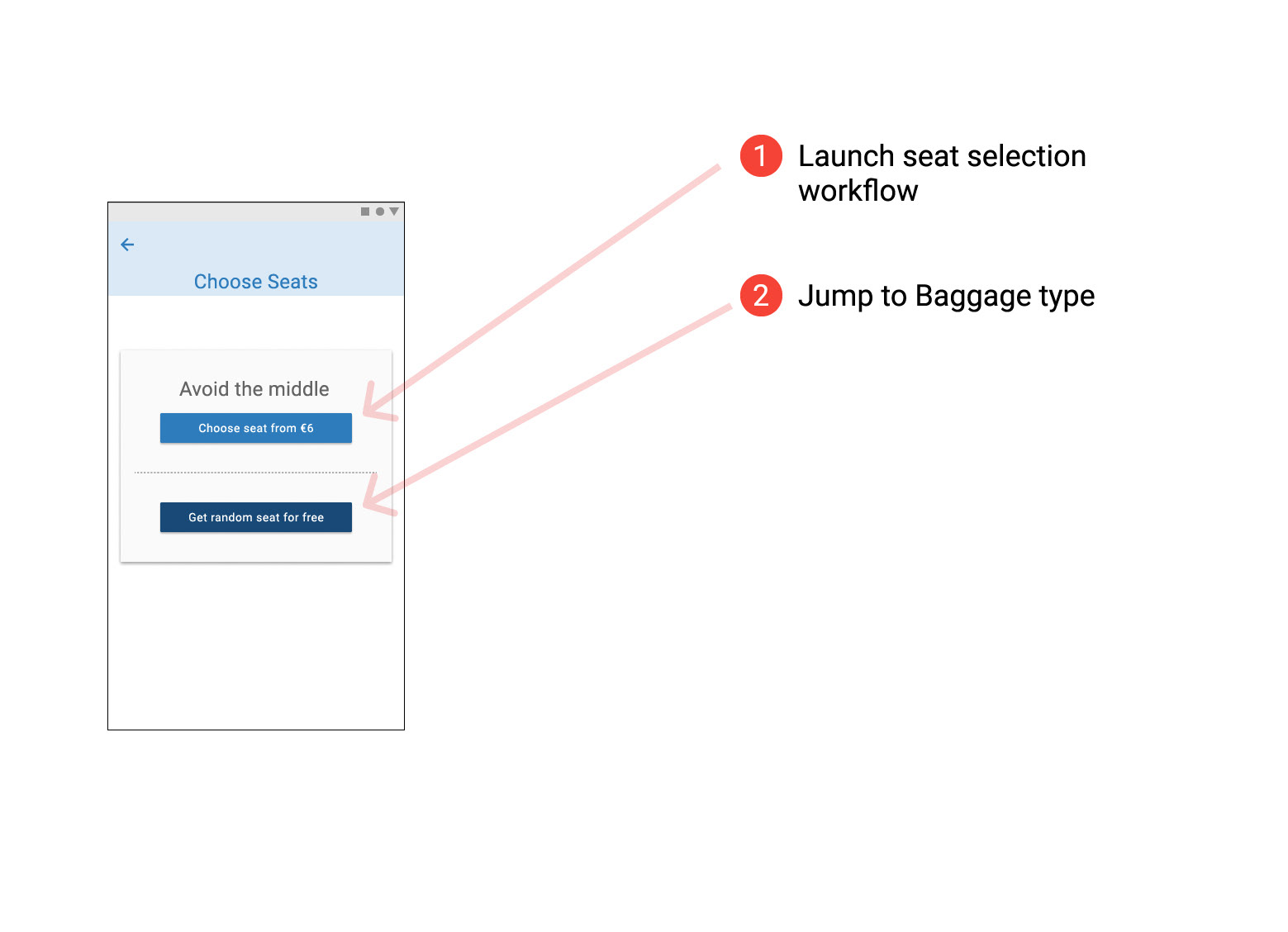
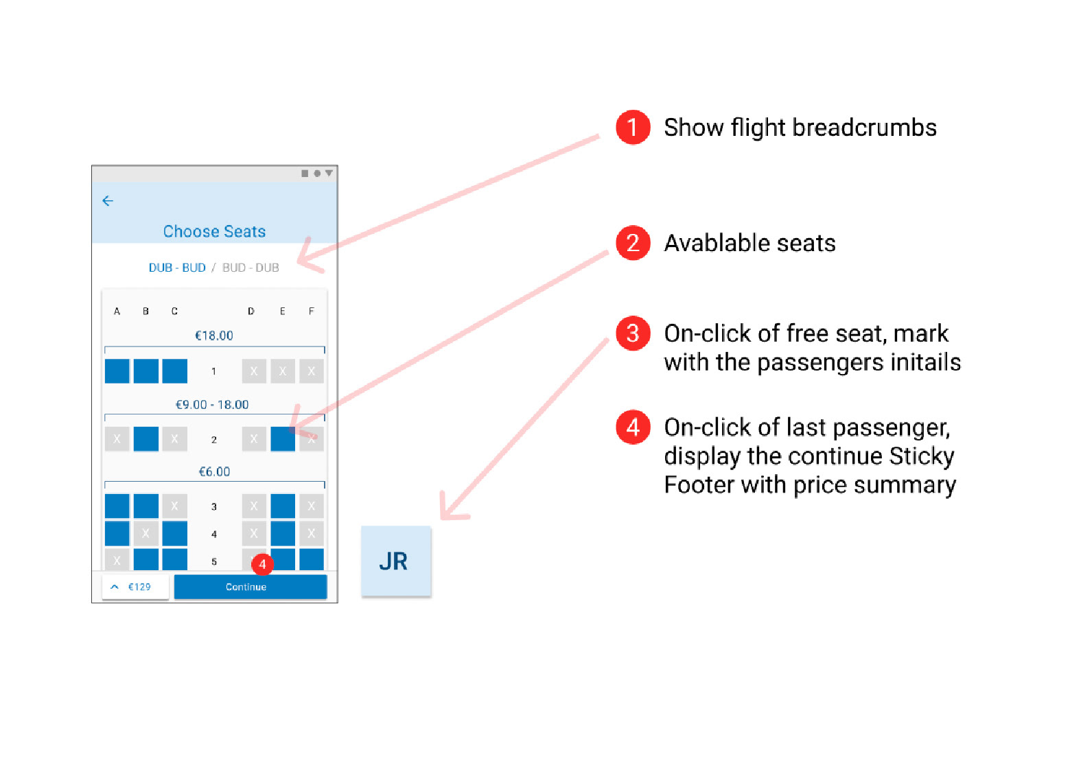
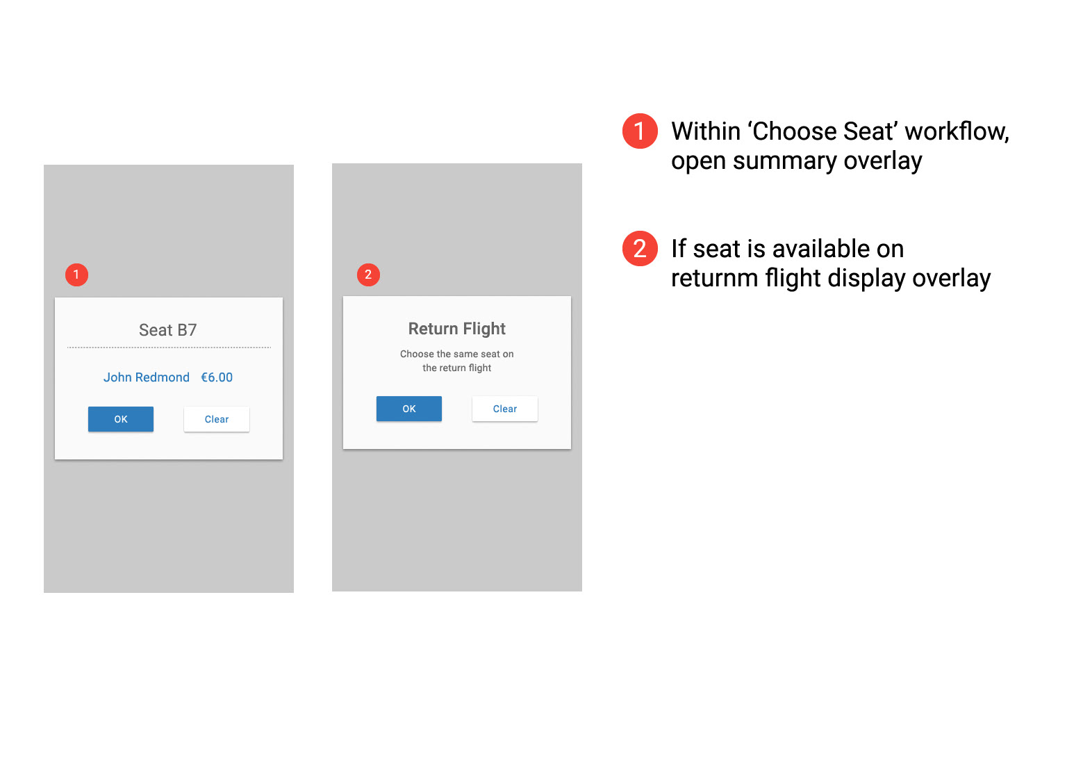
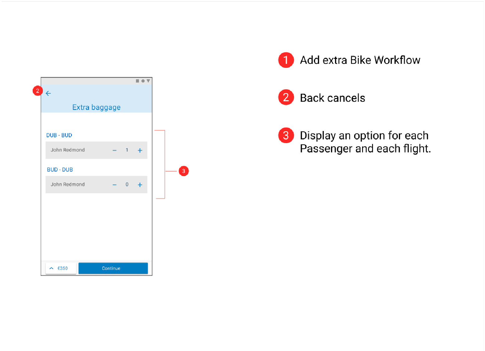
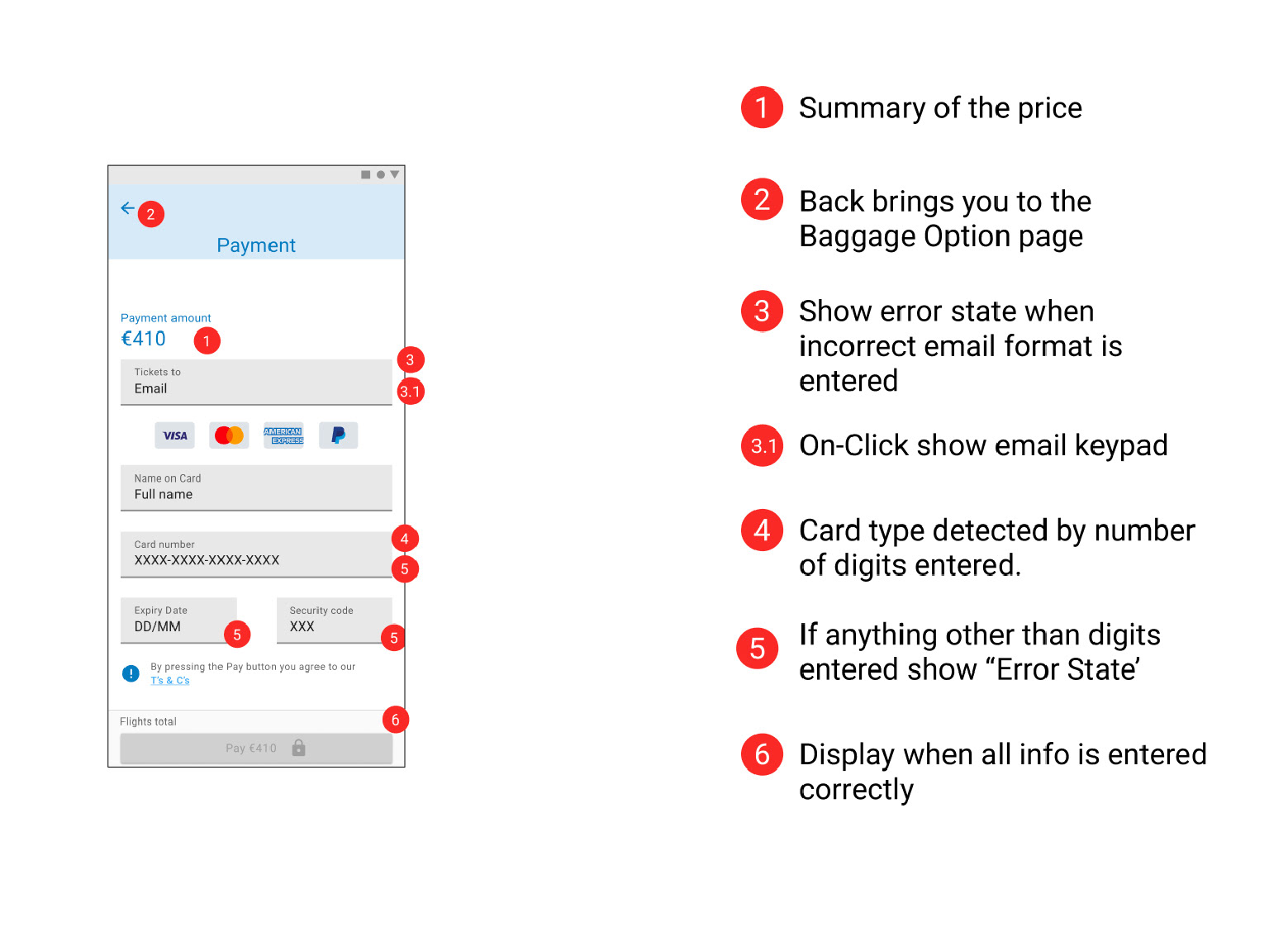
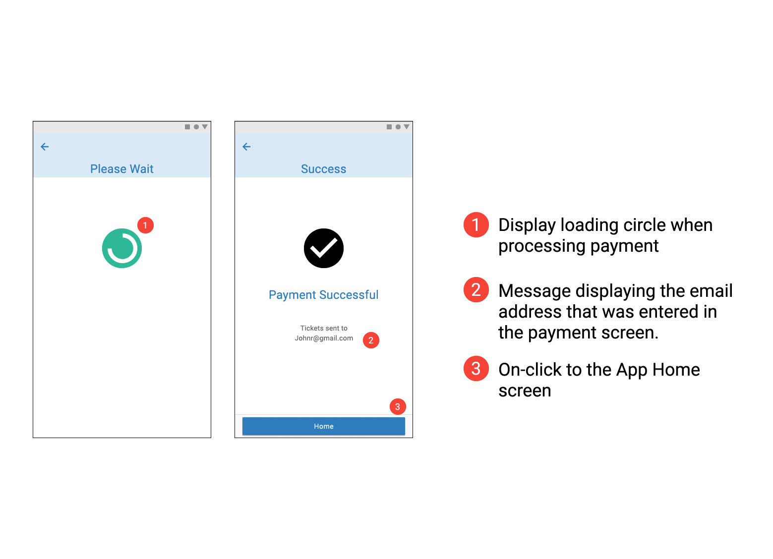
Flight Details, Seating Options, Baggage Section & Adding Extras
Later sketches made it clearer what was being chosen and reduced the number of clicks required helping to streamline the design and make it clear to the users that they were getting the best value for money. Some repetitive step could not be avoided (Fair type of return and contenting flights) and the user must be given clear affordance while on these steps.
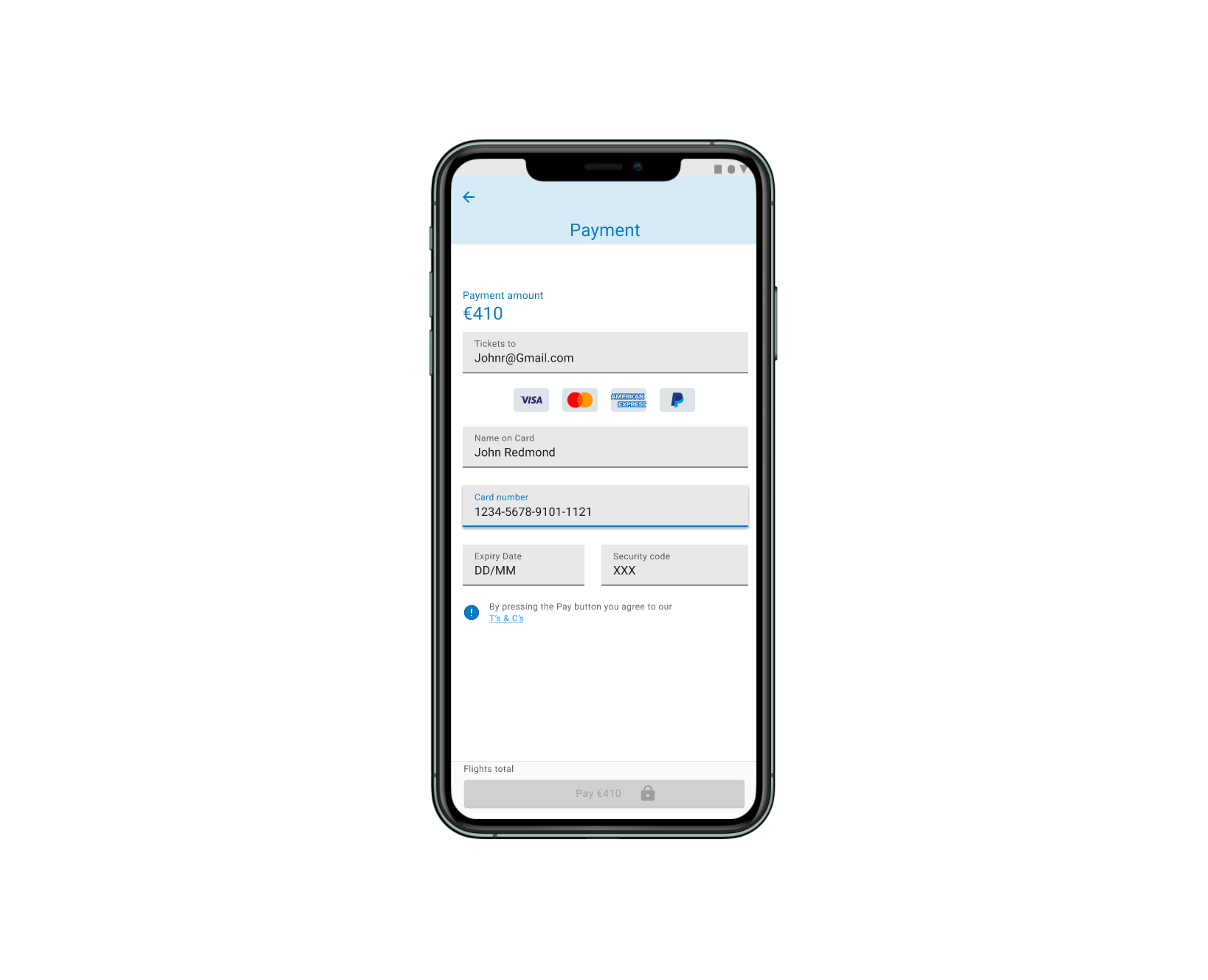
Prototype
After a number of iterations of the interaction design stage and multiple user research reviews, it was confirmed that the design intent was maintained. Then it was possible to proceed with the prototype development. The prototype is a good tool to work with the Product team and validate that the product viability is being maintained.
Figma prototype sharing is currently down. Contact me directly and I can walk through the designs.
Design@johnwredmond.com
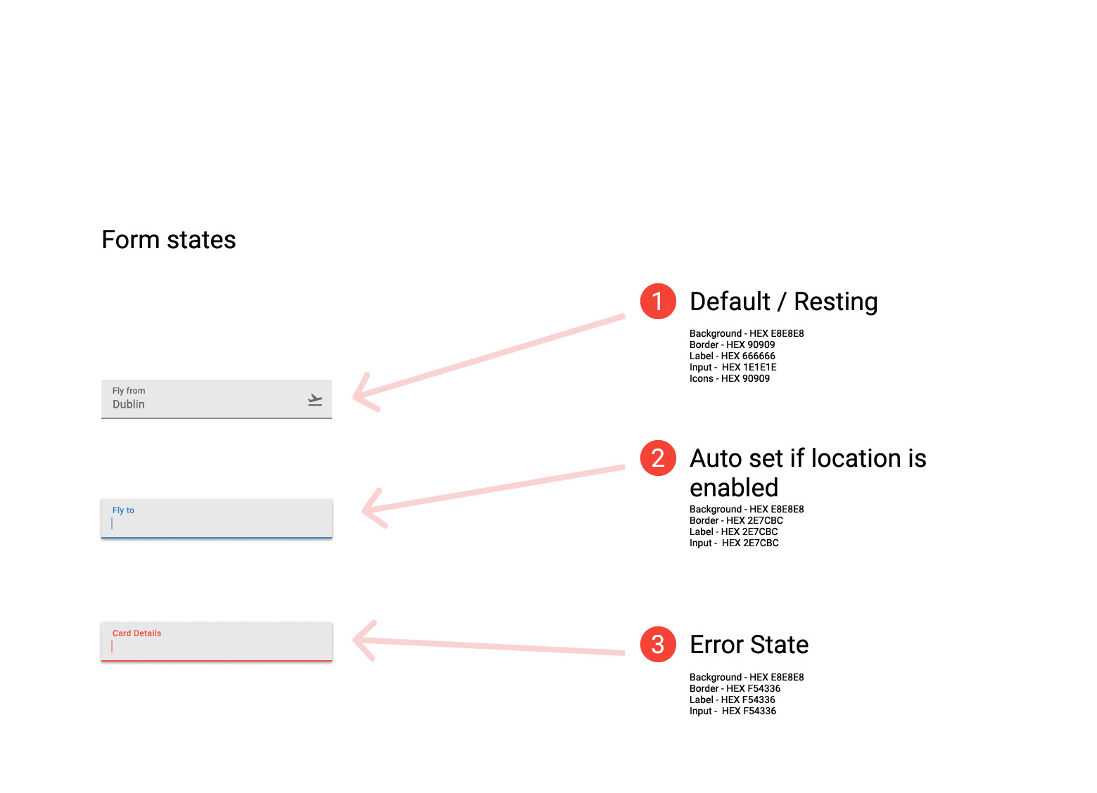
Wireframes
A great way to share work with the Development teams to gather feedback on feasibility. This wireframe is not intended to replace the function of a Design System. Its focus is on navigation, with only a basic overview of component states outlined.


Prototype Usability Test
I recruited three new participants to validate the new prototype so we can compare improvements to our competitors product.
Summary
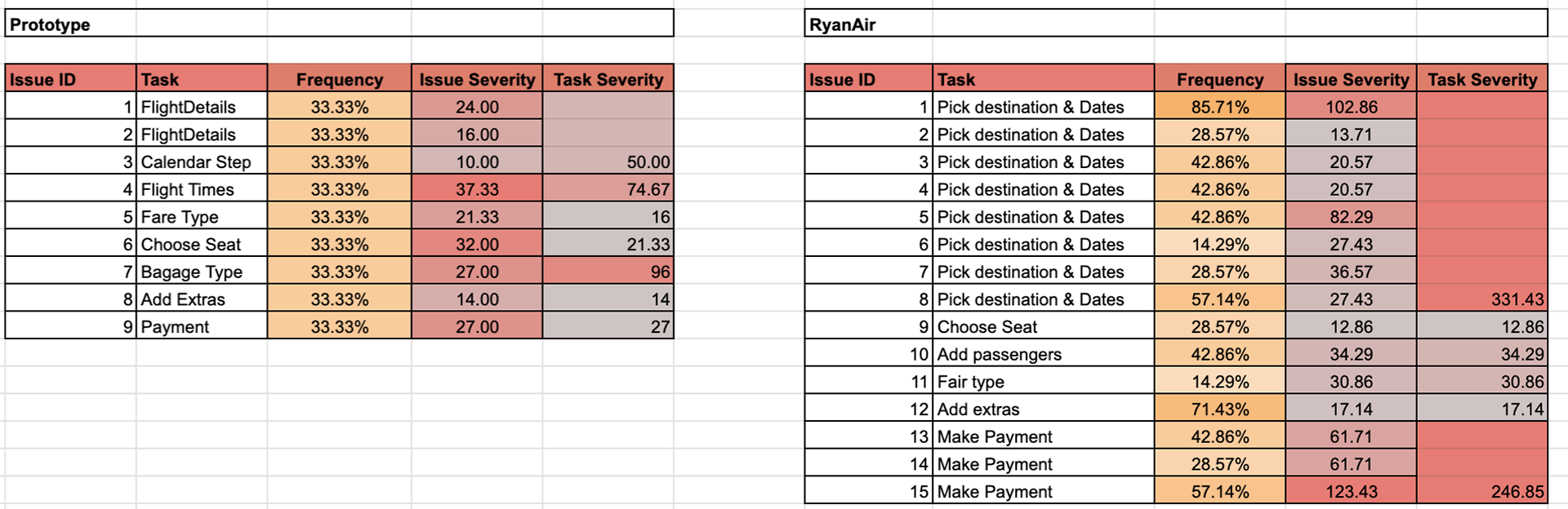
Total reported issues dropped 40%
Destination and Date picking (Flight details) Issues down 62.5% & Task Severity score (Sum of all Issue Severity Scores per task) down to 50 from 331.43.
Fair Type Issues count unchanged & Severity score down to 16 from 30.86
Payment Issues down 66.6% & Severity down to 27 from 246
A scale of 1 - 5 was used to measure user satisfaction. 1 'extremely dissatisfied' and 5 'extremely satisfied'.
Average satisfaction for the Ryan App was 2.1 unsatisfied. The Average satisfaction rate from the prototype was 4 Satisfied.
Next Step
Remove the 'Add Extras' button and replace with a step in the linear navigation that lets users pick an extras they need. This will remove the hub and spoke navigation from the baggage selection step.
We should also remove the 'Value Fair' sub header from the Flight Times step. it is redundant info that adds to the cognitive load of the user before it is relevant.
Furthermore, having confirmed that a streamlined workflow would produce favourable user satisfaction rating and also preform well across business critical functions. We can being development or the critical workflow.
The summary page and a method of Hub and spoke navigation located before the payment step should be next in line for design consideration.
Learnings
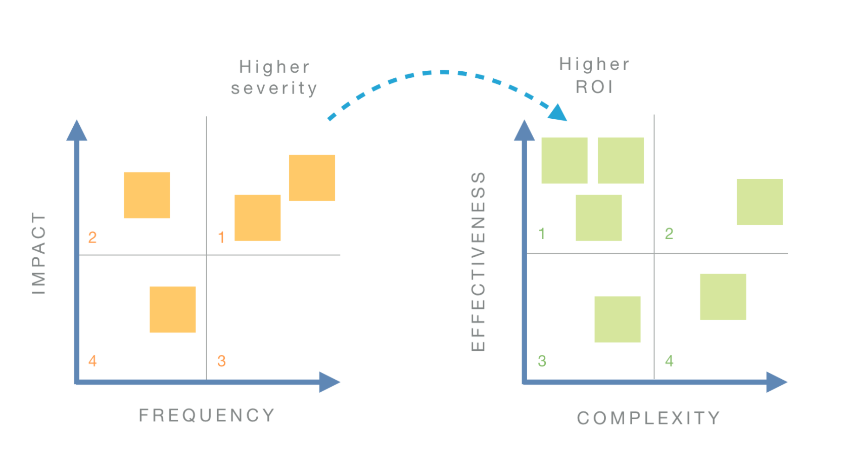
Usability tests are not complete without a list of recommendations and solutions that set clear and obvious ways forward. To reduce the risk of making bad design decisions, we need: a) several alternatives solution to choose from, and b) an effective selection process.
1. For each issue, generate multiple solution ideas
2. Mark additional issues that the solution may address
Add the ideas to following Effectiveness / Complexity matrix to see where the highest ROI is.